Monday, March 10, 2008

lucis art2

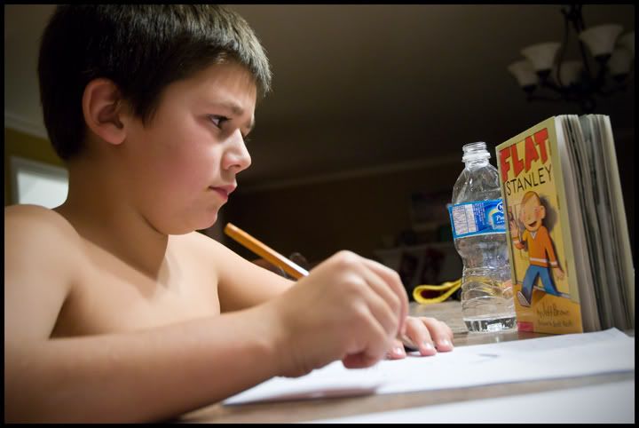
lucis art portrait
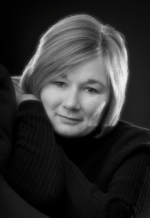
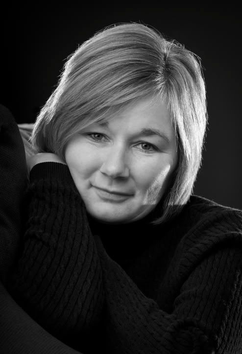
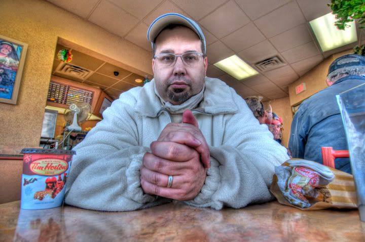
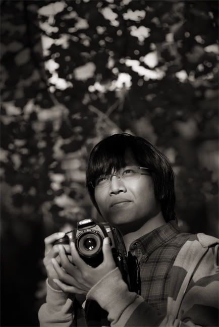
As promised here is another photo processed with the lucis art plug in.
In the original i could not see any detail in his eyes. Again this was overcast light only. There will be another tomorrow.

Sunday, March 09, 2008

lucis art plug in

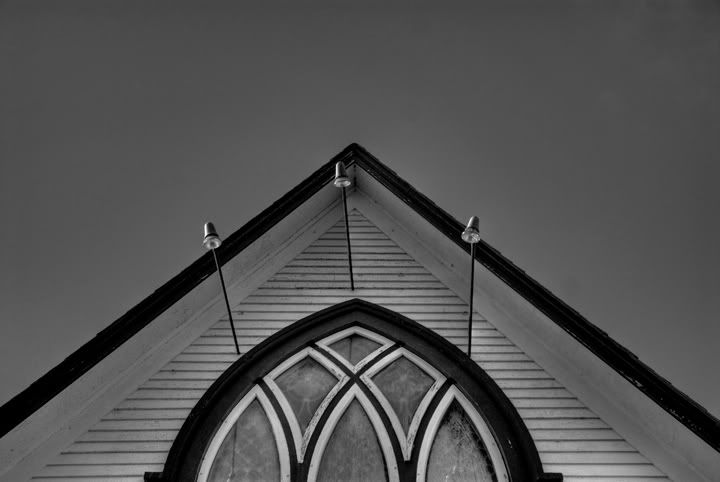
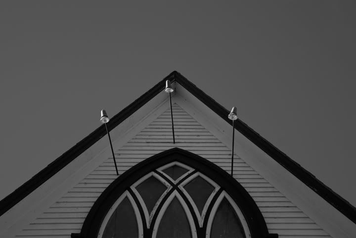
lusic art before and after
Scott Kelby posted a blog recently where he talked about the "dave hill look" and showed how to get close by both using the camera raw plug in and another method using the lucis art plug in. I thought i would give lucis art a whirl and it is really cool to play with. You can download the demo at www.lucisart.com
I used the whyenth effect which enhances detail in your image by manipulating pixel contrasts. Looks like an hdr thing to me.
The above photo shows before and after.
Most people say that you must have the right lighting for this effect to really work. Contrasty light is the requirement so they say. The above example was shot outside under a very overcast sky, certainly not high in contrast. I think the effect worked very well on this image.
I will post more images over the next couple days.

Thursday, February 28, 2008

arena pano

arena pano
Wow, two post in one day. My wife has however reminded me that i should be doing real work and as usual she is right, so two is it for today (ha).
This shot is made up of 49 seperate images. All were shot hand held also. There was more foreground and ceiling in the final composite but i cropped it in a fair bit. This allowed me to keep the celindrical feeling but let the court occupy a larger space in the image.
I started by using autostitch (www.autostitch.net) to create the pano. I then did some retouching as there were about 10 people on the court that i wanted removed.
I duplicated my background layer and turned it to black and white so i had the black and white layer and a color one underneath. I put a layer mask on the top layer and painted in black on it to allow the color court to show through while keeping the rest of the layer in black and white. I sharpened it up a fair bit and i think that was it.
Now back to some real work, or off to bed, well see.

faceit fun

Photobucket
I had to do a studio shoot today of a lady and grabbed a friend of mine to stand in so i could test the light. I composed and shot this image as you see it on the left half of the photo. I used a large softbox quite close to him for the light which is very untypical for me. It was set up (thanks joy) and i just didn't feel like changing it.
Anyway, i liked this image and liked it even better after i had some fun with it. I just created another canvas of the same size (select your original canvas and go to edit - copy, then when you go to file - new the size will already be there for you so you can keep it the same), and went to image - rotate canvas - flip horizontal. I then expanded the canvas size of the original and while holding the shift key dragged the new flipped image onto the original. I slid it over , put a border on it, cropped off the excess and was done.

Wednesday, February 20, 2008

smart objects win everytime

poker
We had a little fun game of poker tonight and while the chips were still down i bravely asked the question to my son, "hey, do you mind if i take a quick shot". You never know how that ones going to go but tonight it was a yes. I knew i had about 1 minute so i quickly grabbed a flash, threw a pocket wizard on it and one on the camera, set the camera on self timer and set it on the table with the lens propped up on a stack of poker chips. I hand held the flash just over his head and pointed straight down at him and the chips. I really liked the shot in camera but his hair and the chips were a bit too bright and his face was a bit dark. Into photoshop we go.
I opened the raw file in camera raw and set the exposure for his face. I held down the shift key which changed the "open image" button to "open object". I opened it as a smart object and then when back into bridge and opened the same raw file again but this time adjusted the exposure for the hair and chips (much darker overall than the first one). I again held down the shift key and hit "open object". Once both versions were open i combined them into one by holding the shift key down and dragging one onto the other. Next i blended them together by using a layer mask on the top layer. My top layer was the dark image so i painted in black on the layer mask over his face and cards to see through to the brighter layer underneath.
I ended up tweeking the brightness of both layers by double clicking on the layer which, because they were smart objects, brought me into the camera raw plug in again.
I flattened the layers at the end, retouched a bit, and then sharpened.
My sharpening technique this time was to go under image - mode and convert the rgb file to lab. Once in the lab color space i went into my channels pallate and clicked on the lightness channel. I applied an unsharp mask at an amount of 270, radius 1, and threshold of 5. I then went back to image - mode and clicked on rgb to change back the my original color space. Sharpening this way will affect your textures but not your color.
Oh, and to cap the image off i went under image - adjustments - hue/saturation and added about +12 saturation.

Monday, February 18, 2008

door removal

Photobucket
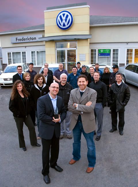
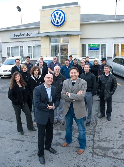
Above is the finished version of this team photo. Well almost finished. I have another version where i sharpened and burnt (midtones) down the faces and front row a bit. I also did a curve to put a bit of magenta in the shadows and a bit of blue in the midtones. Below you will find the raw file right out of the camera.
As you will notice, the background was a little distracting. I decided to remove the door and banners as well as the exit signs and pipes on the walls.
To do this i just duplicated the background layer and did all my retouching on the background copy. I used the clone stamp to cover over the door with parts of the wall. I went right over the players heads that were close to it so i knew it was all removed. This took a bit of time as it was hard to make the lines on the wall line up. I also used the healing tool to get what i needed. When i had the door and banners and everything else removed i then duplicated the background layer once more. I put my retouched layer in between the background and the second background copy. So now when you look at the image you see the not retouched version. I added a layer mask and paint in black over the door and other things that i removed. This let the retouched layer show through wherever i painted in black.
I flattened the file when i was done and added a vignette to darken the edges a bit. I also used my burn tool set to midtones and about 10% strength to go around the edges a little more. Below is the original photo.
Photobucket

Friday, February 15, 2008

snow day

Photobucket
All it has done this winter is snow. I have been looking around and thinking, that would make a good photo, that would make a good photo, etc, etc. I walked outside my work building today and decided to finally take a winter shot.
Not much of a shot really but thought i would post it just the same.
I converted it to black and white by going to image - adjustments - black and white.
I hit ok and then went into edit - fade and faded my black and white conversion to 85% so just a hint of color would be left in.
Sharpened and saved.
Have a great weekend.

Monday, February 11, 2008

hdr combo

Photobucket
The above image was shot in a very dark arena (turned into a convention room). I photographed the event and then at the end, when the premier was speaking, I took my tripod to the back of the rink and bracketed over a 7 stop range.
On the normal exposure for the crowd, the speaker and screens were blown out. Normal for the speaker put the crowd way too dark. It took way over exposing both to bring up the red you see on the curtains as they were just these little led lights.
Another perfect candidate for photomatix.
Photomatix did a very good job at getting the entire image close but where the crowd moved a bit they got a little funky. Also the speaker and screens were still a bit light. To fix this i opened the photomatix tonemapped image, one of the original exposures where the stage was properly exposed, and one where the crowd was properly exposed, in photoshop. I used the photomatix image as my background and then using the move tool and holding the shift key down i dragged the other two images, one at a time, onto this background image. I created a layer mask on both of the top two layers and filled them with black to hide all of those layers allowing only the background to show through. I then painted in white on the layer mask to reveal the stage on one layer and the crowd on the other. Make sure you use a really soft edged brush so it blends in well.
This is an extremely easy task as layer masks could not be easier. If you make a mistake just paint over your troubled area in black and it is fixed.
Oh, and if your showing a friend your final version make sure that you leave your layers pallate open so they can see all your layers and masks. Its impressive to someone who doesn't know much about photoshop (ha).

Sunday, February 03, 2008

photomerge

Photobucket
Sorry for my absence. I have had a very busy january, which while is very good, has kept me off the computer having fun.
The photo above is of a local bakery. If you are local or are visiting fredericton then go to the happy baker. Great coffee and even better baked goods.
Anyway, the store and bakery occupy a narrow long space which was very difficult to capture in one shot. I put the camera on a tripod and took 4 or 5 vertical shots (sorry cant remember exactly)to cover the whole store. I opened bridge and selected the shots i wanted stripped together and then went up to tools - photoshop - photomerge. I was very surprised at how good a job it did. It was way better than in cs2. The only problem i had was that there was a blurry guy at the back of the store. When photomerge creates your pano however, it uses layer masks, so if you dont like something (like the blurry guy) then you can just paint in white on that part of the layer mask and remove him (he was only in one frame not all).
I retouched and removed some distractions and sharpened a bit.
The only other thing i had to do is fix up the carpet as there was alot of white flour tracks in it. I first selected the whole carpet using the lasso tool and refined the selection using quick mask. It took awhile but looked great. I saved this selection to bring it up again later. I duplicated my background layer and then sampled a nice dark brown from the carpet itself and loaded the selection I created earlier. I then filled the selection with this brown color. I lowered the opacity of this top layer so some of the texture would show through and was pretty well done.

Tuesday, January 15, 2008

shoot for the dogs

dogs
This is not really a photoshop tip post but instead an insight into a shoot post.
I was asked to photograph this girl with her two dogs. Simple enough. Start early in the morning so the light is low, get them walking towards me, sun to the left at 45 degrees and take lots of photos with a long lens and shallow depth of field. Recipe for success in most cases. We met and started shooting on a long walking bridge but the side rails cast some pretty severe shadows and although she was perfectly lit the dogs were in shadow. The wind was very strong also and it was wreaking havoc on her hair. Next recipe please.
Time to head to a cool building with a very nice deck and large white wooden chairs. Throw in a couple nikon sb flash unit, like any strobist would, one to the back left for rim light and one to the front right (at about 45 degrees or more) for main light. I own two pocket wizards so i put one on the camera, one on the main light, and put a wein slave on the back light. I then crossed my fingers and hoped it wasn't too bright out for the wein. It worked, yea hoo. I placed my human subject in the chair and then it was time to bring in the dogs. Funny thing was that the dogs really didn't want to be there. They wanted to instead run and play. We must have brought them back under my light setup 20 times and they would last about two frames and that was it, time to roam.
Luckily i inherited a tremendous amount of patience from my father so i could have shot like this all day. I knew it was time for the shoot to end however when mild frostbite set into my fingers.
I did end up shooting about 100 frames but this was my favourite. I think its because it shows a little bit of our struggle.
When the dogs were leaving i could have sworn that i saw one give the other a high five and wink.

Thursday, January 10, 2008

Black and white with blur

Photobucket
I was playing in lightroom tonight and had a chance to take a second look at some images i shot recently.
I was playing with a landscape photo and trying a couple different things (i will post it at the bottom) and thought i would try the effect i came up with on a face. I think i like it better on a landscape but anyway here it is.
First off i opened a color photo of gord and converted it to black and white by going to image - adjustments - black and white.
In the panel that opens i played a bit with the sliders to try to make the image look a bit infared. I moved the red slider to the right and the blue to the left a bit.
I then wanted to blur most everything except his eyes and what was along the horizontal path of his eyes. I duplicated the background layer and clicked on the eye icon to the left of this new copied layer to hide it. On the background layer i then went to filter - blur - lens blur and cranked the radius up to about 55. Quite blurry. I clicked on the top layers eye again to show it and then added a layer mask to that top layer. I selected the gradient tool and used the celindrical shape in the options palatte (4th icon over). I made sure my forground color was black and background white and then clicked at his eye level and dragged the mouse to about his chin. I played with this a bit till i got it right. I then chose my paint brush and painted a bit in black to the left and right of the face on the background.
I smart sharpened and did a slight curve to increase contrast and was done.
Photobucket

Wednesday, January 09, 2008

zamboni

Photobucket
I was asked to take a shot of this zamboni to be put on a certificate to "win a ride on a zamboni at a hockey game".
I certainly could have taken a very standard, boring shot of the thing and they would have been more than happy.
As i already mentioned however, that would be very boring.
Time to have some fun.
I bracketed over a 7 stop range and picked out a very dark exposure, an average exposure, and a very light exposure.
I processed these three images in photomatix (I know, I know. Is this photoshop2 or photomatix2) to get a result i liked.
I then opened that image in photoshop and duplicated the background layer. I left the top layer (copy) in color and desaturated the background (lower) layer. I then created a layer mask (icon at the bottom of the layers palatte) on my top layer. I used a soft edged paint brush with black as the foreground color and painted in the mask over the background. That allowed the black and white layer under the color layer to show through. I carefully painted until no more color was on the background, behind the zamboni.
I then wanted to bring some of the color back into the background (just a bit) so it wasn't completely black and white. I duplicated the black and white layer and the color layer each one more time. What i am trying to end up with is: very top layer being color with the mask on it, next layer down is black and white, next layer down is color, and next layer down (background) is black and white. This very bottom, or background, does not matter. We are really not going to see past the layer above it.
What you will need to do now however is drag mask from the lower color layer to the trash. Just click on it and drag to the trash can at the bottom of the layers pallate and hit delete when the box pops up.
You can now lower the opacity on the uppermost black and white layer to your liking. This will allow some color from the color layer under it to show through.
I flattened the image and retouched it. A heavy smart sharpen, a slight curves adjustment and it was done.
Below is the original.
I will be starting a post tomorrow on how to shoot a team photo and leave a space for someone who is missing and then add him in later. There is alot to this next post so i will do a part of it each day for a week or so.
Stay tuned.
Photobucket

Monday, January 07, 2008

single image in photomatix

Photobucket
I finally figured out today how to process one image in photomatix pro.
The above photo is the finished result and the original image is below.
I love what it does to brick and concrete but really dont like what it does to snow.
I also tried this technique on a family studio portrait and it was amazing how much detail it brought out.
Technique:
- I placed one jpeg into a folder on my desktop.
- In photomatix go to Automate - batch processing.
- Make sure the two boxes (generate hdr image and process with details enhancer) are checked.
- Make sure that ALL is selected in the box in front of "images at a time".
- In location - choose navigate to your folder with the one image in it.
- Hit run.
- It will tell you when its all done.
- Go to your folder that you chose and inside of it will be a new folder called results.
- Open that and drag the hdr image file onto photomatix to open it. (or of course go into photomatix and navigate to that file and hit open).
- Next in photomatix go to HDR - tone mapping.
- You are now ready to play with sliders.
The settings i used for this image are : strength - 100, color saturation - 60, light smoothing - high, luminosity - +7, and the white and black sliders were up quite a bit.
I later sharpened it in photoshop and did a curve to increase the contrast a bit ( i did these same corrections to the original image file below).
Note: you can also play with the settings in the first batch processing window. You will see a settings box just after the details enhancer check box.
Photobucket

Monday, December 17, 2007

downtown hdr

Photo Sharing and Video Hosting at Photobucket
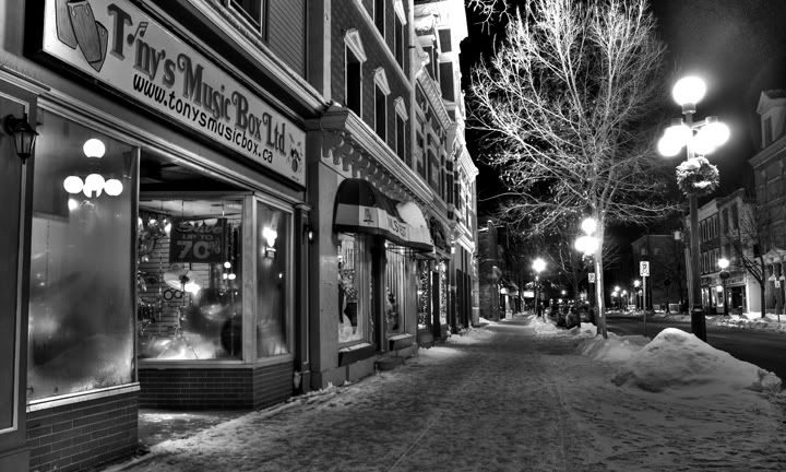
This may well be my last post from the images i shot in the freezing cold downtown a couple nights ago.
I processed three jpegs in photomatix and lowered the color saturation to the far left.
I sharpened it using smart sharpen.
I wanted to try a bit of sepia tone on it for the old fashioned look but i am tired tonight and going to hit the hay.
I still plan to work on something totally different over the holidays and that is combining multiple face photos.

Saturday, December 15, 2007

restaurant hdr

Photo Sharing and Video Hosting at Photobucket
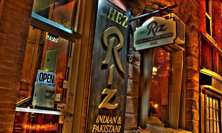
I was doing some downtown shots tonight and tacked on some time at the end of my official duties to take some hdr shots. I did this even though it was unbeliveably cold. My fingers still hurt.
I did my standard 7 frame bracket and then used photomatix pro to process the images.
My settings in photomatix were as follows:
strength 100, color saturation 68, luminance -5, light smoothing low, white point 1.35, black point 5.86, gamma 1.01.
This hdr shot looks 100 times better than the standard straight shot.
What restaurant wouldn't love to have a funky shot in a brochure or ad piece.

Friday, December 14, 2007

camera image number

Here is just a little aside.
Ever wonder how many images your camera has taken in its life.
1) go into bridge and click once on the last image you've taken.
2) go up to file - file info.
3) click on advanced (left column) when the file info pops up and then click on the little arrow beside http://ns.adobe.com/exif/1.0/aux/ (in the right column).
4) at the bottom of that column you will see
aux:imagenumber:????
where my question marks are is where your cameras total image count will show.
I have had my camera for two weeks now and only have 1200 images on it.
Time to get shooting.

desaturated background

Photo Sharing and Video Hosting at Photobucket
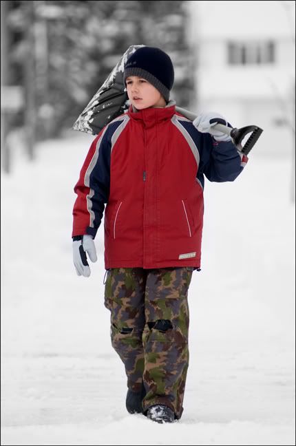
I took this shot of my son last week after a big snow storm. It was the perfect image to desaturate the background, as it was mostly colorless to begin with, and make my subject really pop.
This is a really easy one.
I duplicated my background layer. With this new layer active i went to image - adjustments - desaturate.
I created a layer mask (bottom of layers pallate) and painted in black over my son so that the colored layer underneath would show through. I didn't have to be too fussy as it was mostly white behind him anyway. I used a smart sharpen at about 35 and did a curves adjustment to bring up the blacks a bit for added contrast.
I am hoping to do some experimenting for my next post. I want to use multiple shots combined to form one shot. these would be overlaid over and around each other, not stripped together. I will work on an edge effect so the shots are seperated.
Stay tuned. I also have some shooting to do this weekend of the downtown at night. I smell a hdr in there somewhere.

weird

Photo Sharing and Video Hosting at Photobucket
This is strange for me and no dont worry, i am not heading in some far out direction.
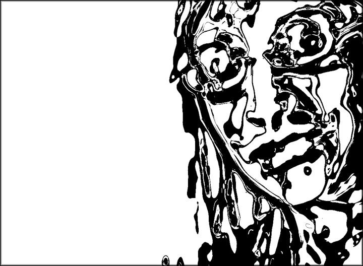
I took a photo of a girl i work with and converted it to black and white. I liked the shot but it didn't blow me away or anything. I thought it had enough potential to look at a second time and see what creative things i could do to it.
I started by duplicating my background layer and with the new layer active i went to filter - sketch - chrome. I used a detail of 0 and a smoothness of 10. I used a levels adjustment and cranked the sliders to the middle so i only had black and white tones.
I actually was going down a totally different route. I started by duplicating my blue channel as i was going to try and make a funky mask and bring parts of the original image through the chrome layer.
I thought this image i ended up with would make a cool poster if text was added.
One added note by the way: you can control how thick your black lines are by where your levels sliders end up. If they are closer to the black side or closer to the white side makes a difference.
For what i dont know.

Wednesday, December 12, 2007

theory of a retouch

Photo Sharing and Video Hosting at Photobucket
The image above got me thinking of a post on retouching.
There are many different views out there on retouching, from "oh my God, you cant retouch as then it is not pure or journalistic" to "anything goes". I like to think i am somewhere in the middle but definately closer to anything goes than to pure.
The camera and photoshop are tools in the image creation process and by developing your skill in both, you can create an image that you have envisioned.
Anyway, i am not trying to get all deep or anything, just trying to let you in on how i see the process.
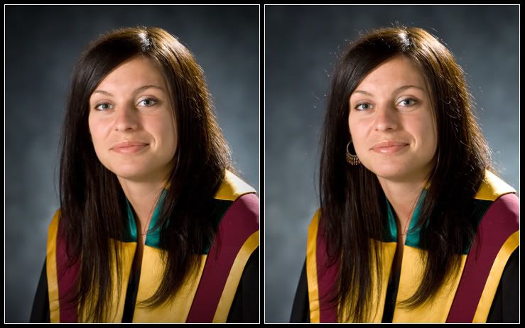
The image on the left is the final retouched version and the image on the right is raw from the camera.
How i tackle retouching is as follows. I first look at the image and decide what i want to look at. Her face for example. In the image to the right my eyes keep getting pulled off the face by the earring and more subtly by the hair highlights.
With these distractions removed I can take my time exploring the face. I tend to start at the eyes, wander around the face, and end up back at the eyes.
So, what i am trying to say is: When retouching, remove tension from the photo. Tension being those elements that want to rip your eyes away from what you really want to look at.
I used a combination of the healing tool, clone stamp, dodge, burn, sharpen, and ended by adding a vignette.

Tuesday, December 11, 2007

door

Photo Sharing and Video Hosting at Photobucket
Ok I know, this is another hdr image, let me explain.
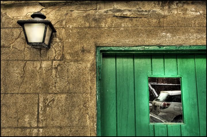
I saw this doorway and had to shoot it as i thought it would look amazing in hdr. I used 7 bracketed images and ran them through photomatix pro. I did my thing with the sliders, no secret, just played until it looked right, and then opened the image in photoshop. I wanted to brighten up the lamp as it was grey and low contrast. I first duplicated my background layer. I selected the front pane of glass on the lamp and applied a celinderical gradient going from white to transparent. It looked a bit better but not great. I tried changing the layers blend mode to overlay and it looked better but the rest of the image got over saturated and looked a bit overdone (can you imagine). I desaturated the layer and bingo, everything fell into place.
I am now going to be playing with changing the blend modes of a duplicated layer and desaturating it.

Monday, December 10, 2007

car hdr

Photo Sharing and Video Hosting at Photobucket
I was looking to do something a little different tonight (using blending modes to combine photos) but found that i have to take some texture photos as i dont have any. Look for this in a post to come. I want to change skin into an ice texture.
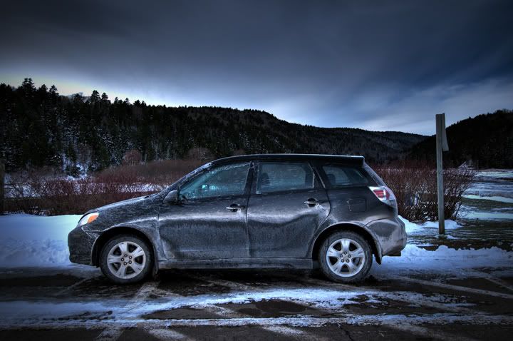
Anyway, i did find this shot of my car that i shot on a tripod and shot 7 bracketed images. I loaded the 7 images into photomatix and played with the sliders. I gave my workflow in photomatix in an earlier post if your wondering.
When i had it how i liked it, i sharpened it alot with smart sharpen, probably with a value of about 90. I then wanted a very dramatic vignette so i duplicated my background layer and added a heavy vignette (filter - distort - lens correction) to this top layer. It darkened the car a bit so i just applied a layer mask to that layer and used a large soft edged brush to paint on the mask with 50 percent black. I just painted over the car and a bit on the ground and background around it for a bit of a halo effect. I used a curves adjustment layer to add a bit of contrast and was done.
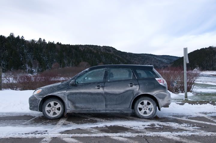
Below is one of the originals.
I promise to get away from hdr for the next post although i do feel that using hdr took a pretty boring image and at least made it into something worth looking at.
Photo Sharing and Video Hosting at Photobucket

Thursday, December 06, 2007

softar filter effect

Photo Sharing and Video Hosting at Photobucket
I need to state right up front that this is not my method. I used one of my photoshop world text books for this and the credit for its development goes to eddy tapp and monty zucker. I felt i needed the effect for this image and wanted to share it with you.
First i opened my image in photoshop and went to image - adjustments - black and white. I placed my curser on the face and left clicked and dragged to the left to lighten the skin. I placed it over the sweater and dragged to the right to darken the sweater. You would have to play a bit with this depending on your image. When i had it looking good in black and white i duplicated my background layer.
Double click on the name of your new layer and call it darken. With this layer active, go to filter - blur - gaussian blur and up the radius to around the size of your file (mine was 25mb so i set it to radius 25). Change the blend mode to darken for this layer and lower the opacity to 30%.
Now duplicate this layer and double click on the name and call it lighten. Raise the opacity to 50% and change the blend mode to lighten. At this point if it looks too soft just redo the image and use a lower radius in the gaussian blur step.
Next hold down the shift key and click on both layers to make them both active. While holding the shift key click on the "new group" icon at the bottom of the layers pallate. Now click on the add layer mask icon at the bottom of the layers pallate.
Using a black soft edged brush, paint over the eyes, lips, eyebrows, and nostrils. I used an opacity of 50% to paint with. I did all these parts once and then did the eyes and lips one more time still painting at 50%. I tried the hair also but did not like it sharp on this image.
The original file is below.
As a side note: I was quite happy with the light on this image. I used two strobes bounced into very large umbrellas that were placed one directly over top of the other. This essentially gave me an umbrella which went from ceiling to floor. With using two lights i could vary the power from top and bottom. I placed these as close to her as i could, just out of camera frame. I used two sb24 flashes for the rim light. One was behind her to the left and one to the right.
Photo Sharing and Video Hosting at Photobucket

Monday, December 03, 2007

hdr gordo

Photo Sharing and Video Hosting at Photobucket
Here is another shot from the weekends adventure.
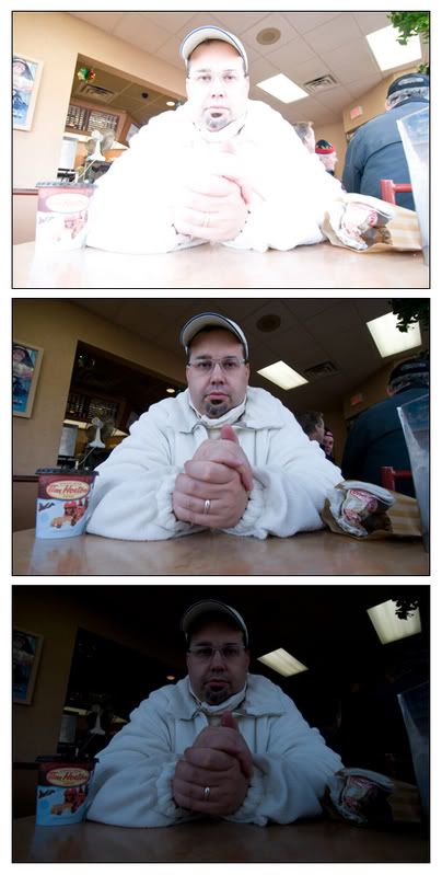
We haden't even really got to shooting yet but the light was so good in tim hortons that i had to run out to the car and get my camera. I put the camera in liveview to test it out and took three bracketed images handheld. I am posting the original files under this text so you can see them also.
I opened the images in photoshop just to knock them down to 8bit files (i had the camera set to 14bit) and saved them as jpegs.
I processed the three images two seperate times in photomatix and then stripped them together in photoshop. The reason i did this was that i liked his face and background in one of the trials and his hands and body in another. I just dragged one image onto the other and used a layer mask to do the work.
I am not giving my photomatix slider info just because it never seems to be written in stone. Just play with the sliders.
I wanted this look by the way in photomatix even though you may be screaming overprocessed. Gordo is truly a cartoonish figure and i felt the effect was needed.
Photo Sharing and Video Hosting at Photobucket

Sunday, December 02, 2007

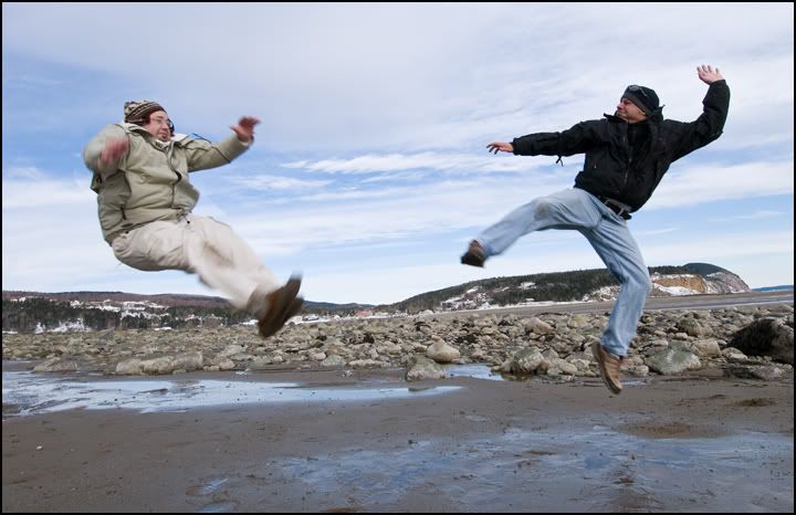
fight on the beach

Photo Sharing and Video Hosting at Photobucket
I got to get away and have a little photo excursion today and now have a ton of new images with which to play with. I will be making many posts this month.
This image is made up of two images. I set the camera up on a tripod and I took gordos photo serveral times as he did some pretty funny jumps. He then shot me doing the same thing. I opened them both in photoshop and while holding down the shift key i dragged one photo on top of the other. My tripod is not the best and it was also sinking in the sand which resulted in the photos not being perfectly aligned. In photoshop cs3 under the edit menu there is a new function called auto align layers which i used next. To get this to be ready to use you have to first go into your layers pallate and highlight both layers.
Auto align worked perfectly on these except for the clouds as they were different in each image. I next highlighted the top layer and created a layer mask. Use a reasonable sized soft edge brush with black as your forground color swatch and paint over the image where you want the underground image to show through (gordo was hidden on the underground layer). This made both of us visible in the image. The sky was not perfect so where i over painted i then switched my forground swatch to white and painted over the over painted areas around gordo. I flattened the image, did a slight curves adjustment to warm it up a bit, smart sharpened 45% and was done.
You can have alot of fun with this. Try shooting yourself in multiple positions in a room and then use this method to strip the images together.

Thursday, November 29, 2007

channel noise

Photo Sharing and Video Hosting at Photobucket
This photo was taken with a nikon d300 camera at 1250asa. Nikon has finally made some good advancements with noise reduction. As a side note, if you dont often need high iso's then just keep your d200's or whatever as you will not see alot of image difference.
I was reading the new napp photoshop magazine today and there was an article on reducing noise on just one channel. It didn't go into a whole lot of detail on the topic so i thought i would play with it a bit.
I started by scrolling through the channels in the channels pallete to see what one had the most noise. Definately the blue channel 9 times out of ten. Funny thing was however was that when i performed what i am going to tell you on the green channel it seemed to reduce more noise overall than the blue. Weird.
So i highlighted, or clicked on to activate, the green channel and went to the filter menu - noise - reduce noise and used a strength of 10, preserve details 9, and sharpen details 8.
I hit ok and then in the channels pallete clicked on the rgb at the top to view all channels together again. It softens the image just a bit but if noise is the problem then its worth it.
I also added a vignette to the image by going to filter - distort - lens correction, and moved the vignette - amount slider to the left (darken) to about -35, i also moved the midpoint to the left a bit too to make the vignette move in closer to the middle.
I put a black line around the image by simply going to image - canvas size and clicking on the relative box then putting in .2 to height and width. For background color i chose black.
Back to the camera for a minute.
I had the setting on the camera set to uncompressed raw and set at 14bit.
When i opened it in camera raw i opened it in the prophoto space (largest color space).
I made my corrections and then opened it in photoshop.
What you will have to do however if you do this is remember to go under image - mode, and knock it down to an 8 bit image when your done having fun with it in photoshop. You must also go under edit - convert to profile, and set srgb in the destination space if you want to put the image online or send it to a photo lab to be printed.
Sorry on this one to be all over the place.

Sunday, November 25, 2007

photomatix again

Photo Sharing and Video Hosting at Photobucket
I got a chance this weekend to get out and do some personal shooting in a small town not far from me.
It was great to just walk around and shoot whatever appealed to me. I also took the opportunity to do some shots to play with later in photomatix.
The image above was created in photomatix using three bracketed exposures. I have already previously done a post in this blog on how to use photomatix by the way so just scroll through to find more about it.
The settings i used here were strength 100%, color saturation 0, light smoothing - high, and then i played with the white point and black point until i got the look i wanted. I did nothing else to the above image other than smart sharpen 40%.
The bottom image is the normally exposed scene desaturated in photoshop for a comparison.Photo Sharing and Video Hosting at Photobucket

Wednesday, November 21, 2007

bridge slideshow

Photo Sharing and Video Hosting at Photobucket
I have been taking a ton of photos lately but none that i have really done any exciting photoshop work on which is the reason for the slow down in posts.
I did however give a talk on composition and learning to see last night which i accompanied with a slide show set to music.
I wanted to make it as easy as possible so i placed my images in two folders, one for the slide show and one for the photos i used during the talk as examples. I opened bridge and navigated to my examples folder first. I numbered the photos from 01 to 13 so they would be in order as i wanted them to show. I selected them all and then went up to the view menu and down to slideshow options. I set slide duration to manual (the slide would not change until i hit the right arrow key), caption - off, centered, transition - dissolve, and hit play.
After my talk was over i presented my recent work in a slide show. For this i set the slide duration to 5sec, caption - off, centered, transition - dissolve, and i slid the speed of transition slider to almost half. I then clicked the done button as i did not want the show to start right then. I went into bridge and selected all my photos so they would be all ready and then got the music ready.
I cued up the music in itunes. I had two songs which i put into their own library and hit play.
I then immediately clicked back on bridge and went under the view menu and down to slideshow.
Now that they were both running i just sat back and enjoyed it.
I used a laptop plugged into a data projector and also had a set of computer speakers for better sound.
I had timed the amount of photos to the music so that both would end at the same time.
The other nice thing was that i did not have to resize my images (most people would crop them all to 800px x 600px). I just stuck them in the folder as is (some of them were big files) and bridge ran them very smoothly.
I highly reccommend this method in running your next show.
The photo above by the way is just eye candy and has nothing to do with this post.

Thursday, November 15, 2007

a bit of everything

Photo Sharing and Video Hosting at Photobucket
Above is the finished version for a change. You will find out how it started at the bottom of this post.
First i duplicated my background layer.
Then I started with the most obvious problem, usually how i decide where to start an image, which of course was the pavement. I used a combination of the healing brush, patch tool, and clone stamp to fix this up, oh yea, alot of patience also.
When i had that looking ok i retouched out the lights on the building and any other little imperfections i could find. I then did a selection of the sky using the magic wand tool with a very low tolerance, between 5 and 10. I hit the refine edge button and contracted the selection by about 25 and feathered about .6. I then inversed my selection and hit the layer mask button which masked out the sky.
I opened a photo of a sky i wanted to use and then drug the image onto my group photo. I placed the sky layer under my background copy layer so the sky only showed up where my mask was on the layer above it. I moved it around until i got the part of the sky i liked.
I added a curves adjustment layer and a saturation adjustment layer and smart sharpened the file.
I used my burn tool set to midtones and darkened the building and cars down a bit to finish this one off.
Photo Sharing and Video Hosting at Photobucket

Friday, November 02, 2007

toned black and white

Photo Sharing and Video Hosting at Photobucket
I really liked this shot i took last week and have been playing with it to see how it looks best.
I shot it with natural light coming through the trees.
First in photoshop i retouched it a bit with the healing tool and then sharpened it with smart sharpen with an amount of about 60. I then went under edit - adjustments - black and white. When the dialogue box open up just ignore it. Instead of moving the slider in the box put your mouse over the part of the image you want to alter and press down on the mouse button and hold it. You now have a scrubby slider which you can move left (lighter) or right (darker). Take a look in the box and you will see that whatever color your mouse is over is the color that is being affected.
After i had the images tones where i wanted them in black and white, i added a curve and added a bit of yellow and red to the middle of the curve. This just gave me a slight warm, or sepia tone.

Thursday, November 01, 2007

photomatix pro

Photo Sharing and Video Hosting at Photobucket
As i promised a week ago, i am going to give a tutorial on photomatix pro.
If you are new to this software you can see some examples on flickr
(http://www.flickr.com/groups/hdr/pool/).
You can download a free fully functional copy of photomatix pro at
http://www.hdrsoft.com/
the only catch is that a watermark is applied. I would highly advise buying it from them as it is only $99 and you get 60% off if you are a student, teacher, or anyone associated with a school.
So how does it work.
It is a program that merges or blends together multiple exposures to give you a hdr (high dynamic range) photo. This means that you are able to see details in the shadows and highlights which may not be visable in a standard photo.
You can make the image look normal or go a little funky like i did to the building shot up top.
First start by using a tripod and bracketing your scene going from almost white to almost black. I usually take about 10 shots of a scene to then pick out 3 to merge together. Next open the images and save them as tiffs or jpegs (i used jpegs).
Put the three images in a folder that you can navigate to in photomatix.
Now open photomatix.
Close down the windows that pop open and go up to the "HDR" menu and down to generate. Hit browse and find the folder where your 3 differently exposed images are. Highlight all three and hit select. When the generate hdr window comes up hit ok.
A generate hdr options box will come up and check the "align source images" box. Also make sure the take tone curve of color profile (reccommended) box is checked and hit ok.
After it does all the work an image will appear and should look pretty bad. Thats ok.
Now go up to the HDR menu again and down to tone mapping. This is where you make your image decisions.
In the box that pops up just play around with the settings. I put the strength up to around 80 or more, the color saturation up, clicked the third or fourth light smoothing box (cant remember, sorry),and adjusted the white and black points to taste.
Hit apply and your done.
Once you do this a few times you will start thinking about images that would look good with this effect. You will also start carrying a tripod with you, which is something i never did.

Friday, October 26, 2007

combining people

Photo Sharing and Video Hosting at Photobucket
I am hired each year to shoot approx. 16 people individually, strip them all together into one photo, print 5x7's, place photos in frames, and then drop off the photos so the company can give them out the next morning at 7am. This year i shot at 6:30pm and had everything delivered at 12:30 that night, last night to be exact.
I started this process by creating a new image in photoshop with a size of 15x21 and 300dpi. I made it this size so it would reduce nicely to a 5x7 and because i shoot with a nikon d200 the individuals dont have to be reduced or enlarged in size when dragged onto this image. They fit nicely.
Next i open bridge in photoshop and rate the images (1 each) of each person 5 stars that will be added to the comp. I then open these rated raw files in camera raw and do my image adjustments. I then open all the files i have corrected in raw.
Now to each photo i select the white background, using the magic wand tool for ease and speed, set to a threshold of about 22. I get as much of the white as i can and then switch to the lasso tool and holding down the shift key i add the rest of the background. Next go to select - inverse to select only the person and then go into quick mask mode and tidy up the parts still not selected, mostly around the feet.
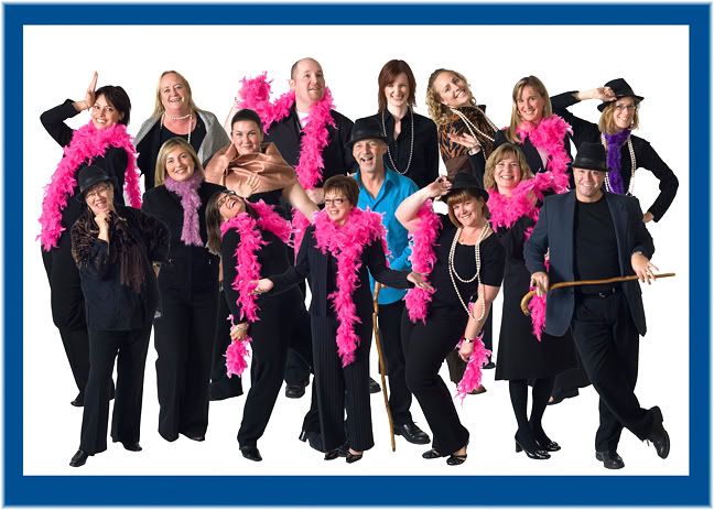
Once your happy with the selection get out of quick mask and hit the lasso tool (just so the refine edge button is visable) and hit refine edge. I set feather to 1px, radius to 1.5, smooth to 13, and contract/expand to -28. I hit the show on black button to check it and hit ok. Then i would reccommend going to select - save selection and saving it in case you need to go back and modify it.
Drag the image into your new image and then repeat this whole process for the next 15 or so people. If some white still shows around the hair or somewhere else when a black jacket is behind it then just create a layer mask for that layer and paint it out. I then just drag the layers around until they make a pleasing composition.
I sharpened, added a curve, and a bit of saturation and was done.
In the final image i also had a logo in the front which i took out in the image your seeing. I placed a border and some guides also so the people would extend approx the same width on both sides and then saved as a psd so all my layers were intact. Now next year when i do this shoot again, the template is already done and i just have to add the new people.
Below is a view of how things looked behind the scenes.
Photo Sharing and Video Hosting at Photobucket

Wednesday, October 24, 2007

just weird

Photo Sharing and Video Hosting at Photobucket
I dont know why i do things sometimes but in photoshop things just happen.
I was not trying for this effect but fell upon it. If you look in sports illustrated magazine you will see the effect used quite often.
I assummed that they would have made a selection and then just applied a stroke, which they very well may do. However this approach would be much easier, especially around hair.
I photographed this lady on a white background and selected the background in photoshop using the color range tool. Select - color range. Just click on the white area in the background and then hold the shift key down and click again, and again until the background is fully selected. I then went to select - inverse , clicked on the lasso tool (just so the refine edge button would show) and then clicked on the refine edge button. I entered a value of 36 for feather and +45 for contract/expand. Since she was on a white background I ended up with a white soft stroke around her.
Just so it would show i opened another photo, of a cool sky i shot tonight, and while holding the shift key down, dragged her onto it. I then wanted her a bit smaller so i used edit - transform - scale, and holding the shift key down to constrain the proportions drug the top corner down until the size looked good against the background. I cropped the image and was done.

Monday, October 22, 2007

more retouching

Photo Sharing and Video Hosting at Photobucket
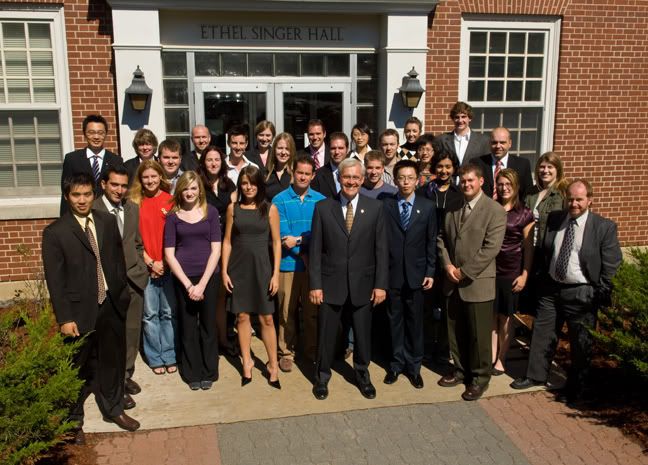
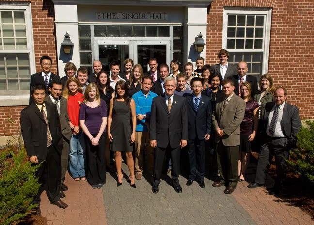
I took this group photo and somewhere along the way decided that i did not like the plywood under their feet. We have done the shot in the same location for about 6 years now so moving them was not really an option. Photoshop of course to the rescue.
I started this process by selecting the board. I used a bunch of selection tools, color range, magic wand, and so on until i had the best i could do with them and then switched to the quick mask mode. If you havent used this mode to finess your selections you have to try it. It is located near the bottom of the tools pallate on the left side of your screen. You click on it to get into it and click it again to exit it. It turns everything red that is not selected and you use your paint brush with white to take away the red (adding to your selection) and black to add red (adding to your selection). The nice thing about selecting this way is that you can use a soft edged brush to get a nice soft edge selection.
Once i had the entire plywood selected i hit the refine edge key to feather my selection just a bit then i duplicated my background layer and hit the delete key to remove the board from that layer. I then turned the top layer off (eye on the left side of the layers pallate and clicked on my background layer to work on it.
I went into filter - vanishing point and drew my grid for the walkway. I will not go into detail about using vanishing point here but if you are cloning anything that has perspective then you should do some reading on it. I used the clone tool with heal turned off in the vanishing point window and cloned the walk so it would cover the entire board that was visable. Now when you turn the top layers visibility back on the board, which we deleted, is now walkway.
Lastly i make a selection of the building sign where it was in shadow and did a curves adjustment to it to brighten it up a bit.
Here is the finished product.
Note: tomorrow i will be doing a tutorial on photomatix pro so stay tuned.
Photo Sharing and Video Hosting at Photobucket

Saturday, October 20, 2007

displacement map

Photo Sharing and Video Hosting at Photobucket
I have been noticing the use of displacement maps in a few new photoshop books i got recently and thought i would give it a try.
I dont know if i have chosen the best two images to demonstrate this effect but i liked the results so thought i would post it.
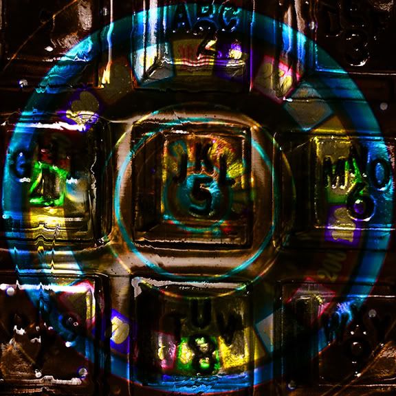
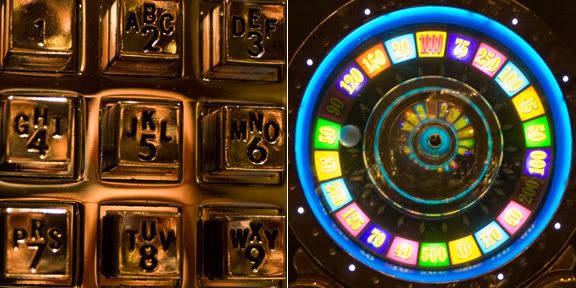
You start by opening the image you want to use as the texture, i opened the phone dial pad. Next open the image you want this texture to be applied to, i opened the slot machine image. Then drag the slot machine image onto the phone image using the shift key to center it. note: i cropped both images the same size before i started.
Then click on your background layer, the phone, and duplicate it (ctrl - j).
Move this new layer to the top of the layer stack and then desaturate it (shift - ctrl - u). Now save the image as a psd but unclick the layers button when the save as dialogue opens. This will save the file but will flatten the file.
Next go back to your top layer, probably still on it, and change the blend mode to hard light. This will blend the phone into the slot machine. To make the phone contour better to the slot machine we have to now use a displacement map.
Click on the slot machines layer and then go to filter - distort - displace. When the dialogue opens type in 5 for horizontal scale and 5 for vertical scale and click on wrap around. You can also leave stretch to fit checked. Click ok. When the open dialogue appears, go to the file you had saved earlier and select it and hit open.
I added some saturation and adjusted the curves after all this was done and sharpened using unsharp mask quite heavily.
I know this was a confusing post and i appoligize. I will try it again soon with two different images.
These are the two images below that i started with.
Photo Sharing and Video Hosting at Photobucket

Friday, October 19, 2007

masking multiple frames

Photo Sharing and Video Hosting at Photobucket
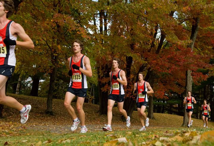
I was recently shooting a cross country race in the park and had an idea to take multiple shots as a runner went by and then strip them together. Piece of cake right? Just use a tripod and nothing changes but the runners position.
Problem was i forgot my tripod. I also wanted a very low angle. So, hand held it is. I laid on the ground and tried to hold the camera very still. I prefocused and turned auto focus off. I took multiple shots as he ran by and the shoot part was over.
In photoshop i processed the images in camera raw and then opened all the ones i wanted to use, actually more than i needed in the end. Once all were opened i held down the shift key and using the move tool drug them one by one into one frame. I used the shot where he enters from the right and drug the rest, in order of his position, onto it.
I next used the new function in cs3 called auto align layers found under the edit menu i think. It did a great job and compensated for my not having my tripod.
I clicked on "layer 1" in the layers pallate and then drew a rough selection around the guy and hit the refine edge button. I smoothed the edge a bit and used a feather of about 2, then hit ok. I then select - inverse my selection and created a layer mask in the layers pallate. Since black was my foreground color it filled my mask with black, leaving only the runner to show through to the layer underneath. I repeated this process for each layer until all runners were showing through and all backgrounds were masked except for the original image.
I flattened the image and smart sharpened it. I also used a hue saturation adjustment layer to boose the saturation up a bit and was done.
I am sure no one will ever use the shot for anything but it was just fun to have fun.
Oh, i cropped it a bit also, just height wise. It is full frame on the length.

Tuesday, October 16, 2007

trying to make something out of nothing

Photo Sharing and Video Hosting at Photobucket
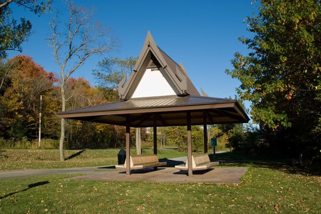
I was asked to photograph this thai shelter so my city could give a gift to a travelling thai delegation. It really is not the best photographic subject so i thought, how could i make it look its best.
I picked early morning to shoot it so the light would be on the shelter and there would be some shadows.
I also bracketed my exposures as i was planning to use hdr to lighten the wood under the roof and darken down the sky and i shot it from every angle possible. I downloaded my photos and made a quick web gallery in photoshop and sent the link to the client. They picked this view and then i got to work.
I had forgotten my tripod so using multiple shots proved difficult in hdr.
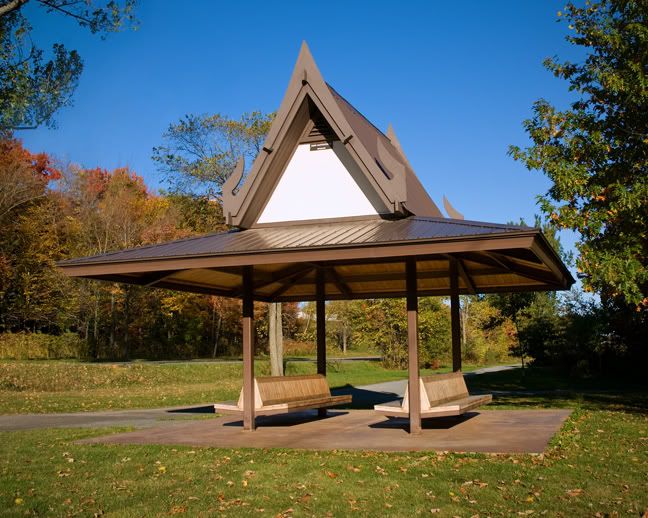
I picked the best exposure and opened it by going to file - place so it would come in as a smart object. Now the trick to this is you actually have to open your photo before and do a select all - copy. Then close your image. Now when you create a new document, place, it will be the right size automatically.
After having this open i wanted another smart object layer so i went to layer - smart object - new smart object via copy. This will give you two seperate layers and each is editable in camera raw, independantly of each other.
I double clicked the top layer and changed the camera raw settings for the under side of the roof. I then created a layer mask and painted everything in black except for the underside of the roof.
I then flattened my file so i could retouch. You could also just created a top flattened layer by clicking on shift - control - alt - E. Or something like that.
I used a combination of the healing brush, clone tool, and patch tool to get rid of what i thought were distracting elements.
Like the dead tree, garbage can, sign shadow, just to name a few. I added a curves adjustment layer and a saturation layer.
I then did a selection of the tree in the upper left corner and copied and pasted it into place so that corner would not be bare. Next came smart sharpen and lastly i added a vignette by going to filter - distort - lens correction.
Here is the final image.
Photo Sharing and Video Hosting at Photobucket

Wednesday, October 03, 2007

white socks

Two posts ago i put up a shot of me looking pretty macho in front of a white mustang. Well guess what, i was wearing my wifes white stubby socks. How cool am I.

previsualization

Photo Sharing and Video Hosting at Photobucket
This isn't so much a post about photoshop techniques as it is about the diary of a job. I will sneak in a photoshop tip however so please continue reading.
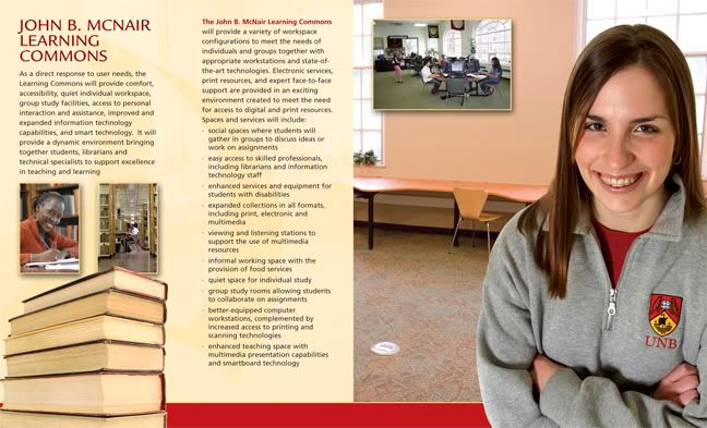
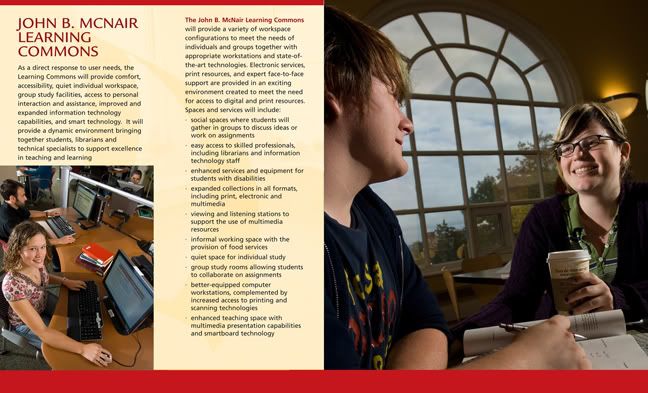
I was sent the beautiful brochure you see before you, as a pdf file, and was asked to freshen it up photographically. It is for a library and the main commons area was just redone. They felt the photos were stale and did not portray the new, lively theme of the library.
I booked the shoot for this morning and ended up shooting 4 different areas in the span of about 2 hours. I went in without any preconcieved ideas except for the lighting. I wanted the light to be a bit edgy and dynamic. In some shots i used three lights and in others i used two, plus some ambient here and there.
We did not have models lined up but instead just grabbed people that were there. They all ended up being great which is rare. I tried some different angles at each location and varied my lens choice pretty well through the range of 12mm to 200mm.
I only took about 120 frames but felt quite happy that i may have something when we were done.
I downloaded the images, retouched a bit in photoshop and rated the images. Out of the 4 different shots i ended up liking 2. I then opened the original pdf of the brochure in photoshop and stripped in the two shots i liked. I added a bit of a red border to the top of the page and was done.
One thing i did not plan but just worked out was the fact that in each photo my main subject would be facing the center of the page.
insert: - photoshop tip. In the photo on the left i brightened up and corrected the color of the computer screens (actually on another file and not the one i am showing here) by selecting the screen (1 at a time) with a combination of the magic wand tool and the lasso tool and then applying a curve to that selection. Remember that when you have a selection and you then go to edit - adjustments - curve only the area inside the selection will be affected. end of tip.
Below is the revamped brochure.
Of course i have not heard back from the people who made the initial request for the images so i fully expect an e-mail tomorrow stating that they would like the shots to be brighter (flat light), without any shadows (flat light), and to include someone of a different ethnic origin, perhaps even someone who is disabled so everyone will know that the space is wheelchair accessable.
I will then walk down with an on camera flash and put them all in a row and go click, click and the client will love it.
Photo Sharing and Video Hosting at Photobucket