With christmas coming i will be on vacation for almost two weeks.
I had almost 300 visits to this site in the past two months and thought i would take some requests to keep me busy. If you have any photoshop questions or specific troubles with some part of it just let me know and i will post some hopefully helpfully tips. Just send an e-mail to
righteye@rogers.com
merry christmas
Friday, December 22, 2006
Thursday, December 21, 2006
adjusting the clock
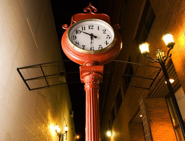
I took a photo of this clock tonight but it was quite dull in contrast and just did not look all that great. I am not sure that it still looks that good but here is what i did in photoshop.
First i duplicated the background layer (ctrl - j). I then desaturated this new layer and changed its mode (in the layers pallet) to overlay. I lowered the opacity to 60% and lastly used smart sharpen at an amount of 80 and radius 1.
This made the contrast much better and boosted the colors up nicely.
Tuesday, December 19, 2006
photoshop cs3
If you are checking out this blog then i am sure you already know that cs3 beta is available for download.
go to
http://labs.adobe.com/technologies/photoshopcs3/
and you will be able to use it, if you have cs2, for two days. You are supposed to be able to have it for thirty days but something is wrong with the serial number generator.
I dont agree with this two day demo crap as this is only a beta version, missing alot of elements, and it will be us that are first in line to buy the real one when it hits the shelves.
You can see some very good tutorials at
www.russellbrown.com
that will get you into the new features.
Friday, November 24, 2006
logo stripping

This is a christmas card idea for my wife who sells volkswagens.
I shot the tree and made sure i had a good sized bulb close to the center of the frame. The bulb was gold when i shot it and my goal was to keep some of the reflections and make it look natural.
I opened the logo in a seperate window in photoshop and using the move tool dragged it onto my tree image. I used free transform, holding the shift key down to constrain the proportions, to make it fit to the size of the bulb. Also to help with this i lowered the logo layers opacity so i could see the bulb size clearly.
I then changed the logos layer mode to hue (modes are in the top left hand corner of the layers pallete). This made the two layers blend and look natural. It killed the white in the logo however so i duplicated the logo layer and changed the logo copy layers mode to normal. I selected the white in the logo, did a select inverse, and hit delete to get rid of all but the white. I then lowered the opacity of this layer to 56% so it too would blend but still remain white.
Lastly i retouched some of the distracting reflections out of the bulb and placed a vignette on the outside of the image.
Wednesday, November 15, 2006
selections of people on white
This photo was one of 16 or so that i wanted to strip together to make one large group photo.
I started by selecting the white background.
I used the magic wand tool with a tolerance of about 30 (lower this if the selection goes into your photo) and clicked on the background.
then hold down the shift key to add to your selection.
I get as much as possible selected with the magic wand and lasso and then fine tune any problem areas in quick mask mode (Q).
Once i am happy with the selection i select-modify-expand (2 or 3 pixels).
I then select-feather (1 pixel).
Next select-inverse.
I can then grab the person (selected) with the move tool and drag them into a new document that i have made for the group.
If you just wanted a white background in the original photo you could have just filled the background with white before the select-inverse step.
Hair, obviously, is the hard part. Thank goodness these people wore hats.
Thursday, June 08, 2006
selective blur
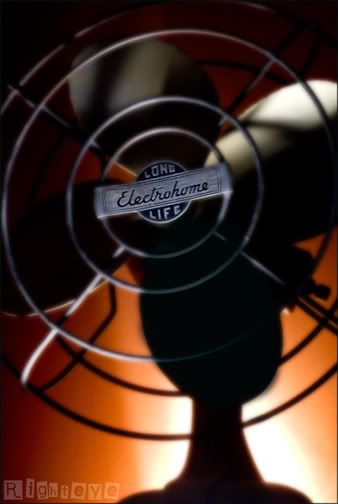
I had some fun tonight shooting this fan i have had for over a year now. I have wanted to make an image of it but the how never came to me until now.
I made the image and felt it needed just a little something else, gaussian blur.
I duplicated the background layer and added the amount of gaussian blur i liked to the background copy. You can lower the opacity if you go too far. I then just created a layer mask and painted in black over the logo in the middle of the fan. I think i used a very soft edged large brush at an amount of about 50 and built it up till the letters were clear.
Sunday, May 28, 2006
links
these are links from the 2006 pdn photo annual from the best web sites section:
www.hanskristianriise.com
www.stevenlippman.com
www.joshrothstein.com
www.ba-reps.com
www.brendakenneally.com/theblock
www.chasejarvis.com
www.stocklandmartel.com/smart_book/2005
www.jefftse.com
www.garryowens.com
www.craigsherodphoto.com
www.marvilacar.com
www.nathanperkel.com
www.benjaminkrain.com
www.andreafazzari.com
www.feinknopf.com
www.allisonvsmith.com
www.matthewstylianou.com
www.glanger.com
www.oculi.com.au
www.dananeibert.com
www.bobbifabian.com
www.seanmurphyphoto.com
www.3am.net
www.jeremycowart.com
www.zizola.com
www.reena-adam.com
www.TogashiStudio.com
www.jamesdayphoto.com
www.mediastorm.org
www.mitchrangerphotography.com
www.noelletheard.com
www.grunertimaging.com
www.jefflipsky.com
www.reneeritchiephoto.com
www.flotowarner.com
www.LifeShots.co.uk
dodge white backgrounds
I do a great deal of portraits on a white background and making that background white is difficult with lighting. You could set your background light to two stops brighter than your main light but this also usually produces flare or interferes in some way with your subject. I dont worry too much about this because i have a dodge tool in photoshop that works quite well. Set the tools mode to highlights in its option bar and the strength quite low (10 - 18). Use a nice soft brush, not too small, and go over the white areas of your background. It should not affect your subject unless they too are wearing white.
Saturday, May 27, 2006
weak channels
This is a great tip for weak color channels. For example, if you shoot something red (flowers for example) you will notice that you dont see any detail in the reds. Heres how to fix that.
Step 1: go to your channels window and click on the red, green, and blue channel seperately (or use ctrl 1,2,3 and the tilde key to get back to rgb).
If a channel is weak you will see alot of white and no detail.
Step 2: choose the channel that the detail looks best in. For weak reds the green channel is usually the best.
Step 3: go to window - layers and duplicate the background layer.
Step 4: highlight the background copy layer and click on the weak channel in the channels palette. You should now be viewing the background copys red channel for example.
Step 5: go to image - apply image.
Step 6: here is what you want the settings to be in the apply image box.
layer - background
channel - green (or whatever channel had the best detail in it)
blending - normal
opacity - 100%
Step 7: hit ok.
Step 8: go to your layers palette and change the blending mode of your background copy layer from normal to luminosity.
Step 9: make sure in the channels palette you are on rgb (you want to be viewing all the colors)
Step 10: lower opacity of the background copys layer till it looks good.
note: you could always make an action of this to use in your workflow.
Friday, May 12, 2006
city hall show
To my former photoshop students, great job on your city hall show.
I was there today dropping off an invoice and out of the corner of my eye saw rebekah staring at me (her portrait that is). If it were really rebekah in person i would probably still be there talking (just kidding rebekah).
Quite honestly i did not expect to be as impressed as i was. It looked very professional and the images were very well chosen. Congratulations.
ocean in color
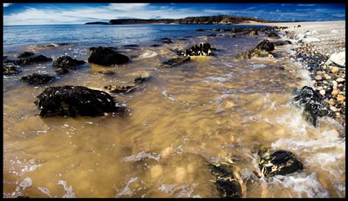
just wanted to post the color version.
I used the same technique that i did with the cat.
Thursday, May 11, 2006
color space for web photos
See, back already.
When you post images to the web or send them to a 1 hour lab for printing, make sure that they are in the srgb color space. If you are shooting in raw just make sure that the space in the bottom of the camera raw dialogue box is set to srgb. If you have a file in the rgb 98 color space just go to the edit drop down menu - convert to profile - destination space - srgb. Just do a comparison and you will see the difference.
I am not saying by the way to never use the rgb 98 space as that is what i use the most. It has a greater range than the srgb space. I use it for photos that will be seen on my monitor or photos that i will print locally (ink jet printer in office).
photographers site
sorry for the slowdown in posts.
I have been preoccupied by photography lately.
My thoughts and efforts have been dedicated to photoshop for years now but recently i have become interested once again with lighting and overall photography. I will still be updating this blog with photoshop stuff regularly and cool photos. Keep watching. The main reason for this post was not to talk about my thoughts but to give you a link to a bunch of photographers work.
http://www.ba-reps.com/list/photographer
Be back soon.
Saturday, May 06, 2006
cool effect
This is Fred.
Ok, now that introductions are over what did i do to the photo. I have been playing with an effect (all mine so far as i can tell) that messes with the color and depth of the image a wee bit.
First i duplicated the background layer and highlighted the background copy in the layers pallete. I went under the image menu and down to adjustments - channel mixer. I clicked on monochrome at the bottom and then slid the red channel all the way to the right, took the blue quite far to the left (not all the way), and then the green to the right just till it looks right. I hit ok and then in the layers pallete changed that layers mode to luminosity. I lowered the opacity to about 80%, added a curves adjustment layer to boost the contrast, added a saturation layer adjustment to boost the saturation and ended by smart sharpening. I recorded all of the steps (not the curve and sat layers) in an action and can now use it on other images quite quickly.
Thursday, May 04, 2006
ocean 2
I am waiting for my 350 images to download that i shot tonight and thought i could take a minute to post another ocean trip photo. All i did to this one in photoshop was crop and sharpen. Also my friend noel would be proud of me as this is a found shot and was not altered while being photographed.
Wednesday, May 03, 2006
ocean black and white
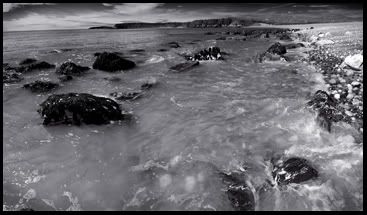
I had a few minutes after a shoot today and thought i would do a little fun shooting and get a bit of sun. In the short time i was there i came away with about 5 seperate images that i liked. This image was of course 3 seperate photos stitched together. My stitching software and photoshop photomerge did not work at all on this project so i had to do it manually with the help of layer masks. I made a mask on the center photo and then applied a gradient to one side to blend into the background image. I then had to do the other side and that was even more fun. I copied the layer with the mask on it and held the ctrl key while i clicked on the layer mask. This gave me a selection of where my mask was. I inverted the selection and hit the delete key which got rid of part of the image on that layer.
I then place the layer mask in the trash and made another one. This time i used a gradient in the mask but applied it to the other edge of the layer to blend that side. I then sharpened the file and converted it to black and white in channel mixer. I put the red channel all the way to the right and moved the blue channel quite far to the left. I used the green channel to lighten it up a bit in the midtones. A little border and done.
I will post another tomorrow with much fewer photoshop steps.
Thursday, April 27, 2006
adding image size
I have a job coming up and my client needs a high res file to print 11x17 for a calendar.
No problem. At least thats what i tell them. They dont know that my camera will only capture a file that is 15x10 at 200dpi.
I tried some tests to see how best to add two inches to the height while keeping the dpi at 200.
I tried 4 different methods and its quite hard to tell the difference in a print between them.
What i kept similar in all of them was the way i scaled up two inches. I created an action and went to image - image size.
I went up in half inch increments and changed the mode at the bottom to bicubic smoother each time until i got to 17 inches. This means that yes i went into image size four times and hit ok after each half inch addition. Where i modified the other steps was in the sharpening. I tried sharpening first then upsizing, tried upsizing then sharpening, and lastly tried opening my raw file as a 16 bit prophoto file, upsizing, sharpening, converting to adobe rgb98, mode to 8 bit. For all the extra effort i cant really tell a difference. The file that looked the worst however was the one i sharpened first then upsized.
I now have the word out to sell my d70 camera and am ordering a d200 very soon. Dont tell my wife.
Monday, April 24, 2006
lens baby
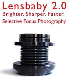
Just a quick note to let you know that if you are a student or educator you can get a much better price on a lens baby. Just go to www.lensbabies.com and order direct from them. We have one on order and cant wait to play.
Friday, April 21, 2006
layer masks
Another blog requested by the paperboy.
Layer masks are a great way to blend images and do local tonal range adjustments.
If you have an image open just drag the background layer down to the create new layer icon in the layers pallete to make a copy of it. Now if you look at the bottom of the layers pallete, the third icon from the left is "create layer mask".
Click this and you will see the mask appear on that layer in the layers pallete.
You now use a paint brush with black ink to hide that layer that the mask is on.
If you make a mistake with the black just paint it back in with white ink. Obviously if the bottom layer is the same as the top this mask will acomplish nothing. Select the bottom layer and do a curve adjustment on it. Now when you paint with black in the mask you will see the underlying layer show through.
Remember that you can use a brush with a low opacity to show through lightly.
You can also apply a gausian blur filter to the mask to blur it.
Friday, April 14, 2006
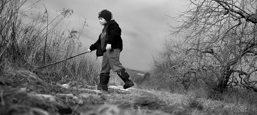
orchard
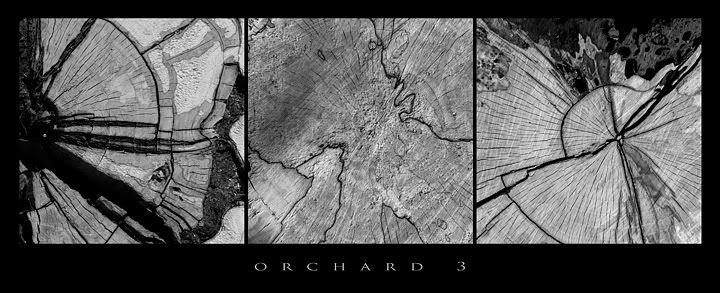
Its funny how you can find a place that just seems to enlighten you.
My son and i walked through the apple orchard today and there was nowhere else i would have rather been. I will be going back often and will have many photos to post.
Thursday, April 13, 2006
old photo site
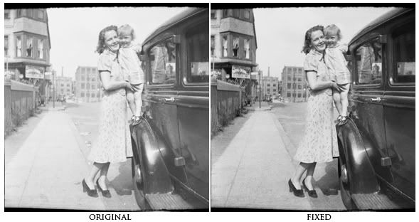
My buddy the Guru just posted a cool site.
http://westfordcomp.com/updated/found.htm
I enjoyed looking at it but at the same time noticed how badly the images were in need of some photoshop work.
I thought that it would be a perfect place for photoshop students to find images to practice on.
I am showing one here I downloaded and worked on for a minute.
I corrected the contrast (via a curve of course), retouched it, used the burn tool set to shadows to darken up the background buildings and sidewalk, and sharpened it using smart sharpen.
Try one, its addicting.
Tuesday, April 11, 2006
feather viewing
Just a quick easy tip tonight.
If you want to apply a feather to a selection to soften the edge you would go to the select menu and down to feather, enter the amount of feather you want and hit ok. The trouble is that you can never tell how much it will feather because it does not give you a preview. If you want a preview just go to quick mask mode (q) after you have set your feather and you will see what affect it will have.
If you want to apply a feather to a selection to soften the edge you would go to the select menu and down to feather, enter the amount of feather you want and hit ok. The trouble is that you can never tell how much it will feather because it does not give you a preview. If you want a preview just go to quick mask mode (q) after you have set your feather and you will see what affect it will have.
Monday, April 03, 2006
autostitch
Some of you who like to stitch photos together using photomerge or the crazy people who do it manually, may be interested in this post. You can download a free stitch program (windows only) at
www.autostitch.net
By default it creates quite a low res file. If you go into edit - options however you can change the size to 100% and jpeg quality to 100. Then all you do is go to open and select the jpeg files you want it to stitch. Hit ok and it does its thing. Very easy and extremely accurate.
The sample i am posting is made up of 26 images that were shot vertically and handheld. I retouched the sky and water a bit but only for objects that were in the original photos and not for any problems the software had.
Monday, March 27, 2006
white teeth
I do not have much time tonight but still wanted to add a tip.
I had to brighten up some yellow teeth today and thought i would pass the approach along as it was still fresh in my mind.
Select the teeth, i use the lasso tool. Go to image - adjust - hue/saturation.
Here go to the yellow channel and raise the lightness up a bit, also you can lower the saturation a bit. Quite easy.
Saturday, March 25, 2006
image size
My paperboy and good friend dana was looking for some advice yesterday on making a digital file larger in printable size.
I thought i would share some of that advice.
If you want to make your image bigger in height and width:
1) go to image - image size
2) make sure constrain proportions is checked
3) if your files resolution is higher than 200dpi then uncheck the resample image box and change the resolution to 200dpi.
4) hopefully that will get you close to your target size but if not, check the resample image box, set the dropdown menu to bicubic smoother (it should be on bicubic by default), and start scalling upwards in size in 10% increments.
5) after you hit ok to the first 10% adjustment you will have to go back to image - image size and type in the next 10% jump and also set the dropdown menu to bicubic smoother again (you can set a new default by going in to photoshop preferences under the general tab and change it if you like).
If you want to make your image smaller with the image size dialogue box:
1) go to image - image size and check all boxes.
2) set the dropdown menu to bicubic sharper and type in the dimensions that you want.
Personally i just use the crop tool and set the size i want in the options bar when i am shrinking something.
Monday, March 20, 2006
podcasts
I talked to my students today about our relationship soon coming to an end. I did not see any tears in the crowd and one girl didn't even know i was in the room let alone speaking (you know who you are).
My point in all this is that they will have to start finding resources for advancing their photoshop knowledge on their own. As photographers, photoshop will be an invaluable tool. They don't believe me yet but they will before long.
One resource i have used myself lately is podcasts. You can download itunes from
www.apple.com
and then go to the podcast link on the left hand side. Then click on the words "podcast directory" at the bottom of the page. Scroll down a bit until you see the search space and type in these names to start you off:
- russell brown
- photoshop tv
- photoshop tips
In the photoshop tips you are looking for matt kwoskowski killer tips.
I subscribed to them all (free of course) and just double click the subjects you want to watch and click on the little video window at the bottom left of the itunes screen and it will become bigger.
Watch and learn.
merge to hdr
i have been playing with merge to hdr recently and have been encountering a few setbacks. I will not go into elaborate detail here on how to use hdr as instructions for it are all over the place.
For a good tutorial go to
http://www.luminous-landscape.com/tutorials/hdr.shtml
One thing that no one seems to make obvious is how to convert it to a 16 or 8 bit file after you have it saved in a .pbm format. This is easy when you think of it but when you are having trouble to begin with its just one more pain.
After your computer does its magic and you have set the white point slider to where you like it and then hit ok an image appears, magically of course. You then save this file (.pbm extension) and close it. Well you really dont have to close it but i did so you might as well too. Open this file and go to the image menu - mode - and down to 16 or 8 bit. After you choose one and click on it a window will appear which is where you set the mode to local adaptation and adjust the curve.
Now that i've got this far i cant seem to make the image look good using the curve. I will try it again tomorrow. Keep your fingers crossed.
Monday, March 13, 2006
cute photo
Just wanted to post a cute photo i took on the weekend.
I turned my living room into a studio for a couple hours.
I used two lights, one pointed at her from behind on the right and
the main light was to the left with an umbrella.
I had to put some cardboard around the back light to contain
the spill and thats about it.
Wednesday, March 08, 2006
saving actions
My buddy, guru gord, has come through for me once again.
I wanted to create an action to send to him but i could
not figure out how to save it as the save action command was
greyed out.
Heres how to save an action:
- go to window menu - actions.
- click on the small triangle in the top right corner of the palette.
- go to "new set".
- name it what you want and hit ok.
- go to triangle again and down to "new action".
- name it what you want, give it a function key if you want, and hit ok.
- create your action and when done hit the stop button at bottom left of
actions palette.
- click on the action set you just created in the actions palette (not the action) to highlight it.
- go back to the triangle and down to "save actions".
- a save as box will come up and you can put it in a folder somewhere on your computer.
This will result in a .atn file that you can send to friends or save for future use.
For them to load this action here is the roadmap:
- mac: just double click on the .atn file and it will go into your actions palette.
- win: go to the triangle again and down to load actions. Navigate to the .atn file and click on load.
(if you want to know where your .atn files can be found to to my computer, adobe, photoshop cs2, presets, photoshop actions).
car photo
My main reason for this post is just to break up the boredom of text
with the addition of another photo.
I did this one recently for a local volkswagon dealership.
I converted it to black and white in the raw plug in box.
Retouched it a bit.
Dodged the left side of the face (our left) with the dodge tool set to highlight mode
and set to 18%, just to bring out that side a bit more.
I smart sharpened and i was done.
Monday, March 06, 2006
border for cutting
I often will drag images to a new canvas for printing.
I can do a small area crop to print so i can save both ink and paper.
Just start with a new file that is 8x10 and the same dpi as your images you want to print. Crop your photo and flatten the image. Drag the photo to the top corner of the page and do a print. Assess it and if changes need to be made just do two steps backwards to your original photo and make your changes. Crop and flatten once again and drag the photo onto your printing page so it sits beside your first test. You can now either just hide the first tests layer or drag it to the trash.
I find when i make my final print, if the background or any part of the photo is white and is touching the edge, i never know where to cut it because there is no seperation between the photo and the white paper.
Make a small border for a cutting guide.
- select - select all.
- select - modify - border and enter 1 pixel.
- edit - fill and fill with black.
- select - select all.
Then you can drag this file to the printing page and see where it ends.
I have an action made for this process so i just need to hit a button and it is all applied.
b&w conversion
There are many ways to convert an image to black and white.
Here are some.
1) If shooting in raw mode just move the saturation slider all the way to the left in the raw plug in window. You can then go into the calibrate tab and adjust the sliders to your taste.
2) Go to the image menu - adjustments - desaturate.
(note: i have typically used this method and then just applied a curve)
3) Go to image menu - adjustments - channel mixer. Click on the monotone check box and then start to play with the sliders.
4) Go to layer menu - new adjustment layer - hue/saturation.
Move the saturation slider all the way to the left.
Go to layer menu - new adjustment layer - hue/saturation and create a second adj. layer.
Hit ok when the box pops up.
Drag this layer under the first hue/sat layer in the layers palette.
Change blend mode to color (second hue/sat layer only).
Now double click on this layer and play with the hue and saturation sliders.
I also added a curve adjustment layer to the top of the layer stack and bumped up the contrast a bit.
I just applied this method to 10 wedding reprints and it worked great.
My settings were hue -32, sat +2.
I did need the curve for contrast.
Saturday, March 04, 2006
new type layer
This tip was just posted on another blog i read.
If you are creating multiple text layers in a document sometimes when you click in your photo with the text tool it will just put the curser into a previous text layer and not create a new one. If this happens just hold the shift key down when you click in your photo area and a new layer will be created.
Another way to do this is to duplicate one of your text layers and then double click on it in the layers palette to alter it. It will all highlight and you can start it over from scratch.
choose layers
Sorry for the slowdown in posts.
I have been very busy lately shooting and have not been able to type.
Todays tip is a short one but nonetheless very important.
If you are combining multiple photos together (which i do alot of) sometimes it can be hard to select the layer you want to work on in the layers palette.
For example i have photographed 130 people individually before and placed them into one large group photo. Try to find the layer of the guy in the red shirt in the second row. They all have red shirts on by the way.
Forget about the layers palette and just apple click on the guy in the photo.
Presto, layer is selected and ready to alter.
Monday, February 27, 2006
brush tip shape
One of my students was trying to paint eyelashes on her portrait today with a grass brush. The brush was curved to the right and she needed it curved to the left and the angle changed as well, to match the eyelashes that were already there. I could not seem to figure it out in class but as usual i got it in about 5 seconds sitting in front of my home computer (i think it is because i have my magic photoshop slippers on ?????).
Go to the window menu and down to the brushes palette. Make sure you have the brush tool active in your toolbox. In the brushes palette click on the words
"brush tip shape".
You will then see many options that will change your brush.
I clicked on the "flip x" checkbox to make the brush curve to the left and then played with the angle circle to tweek it a bit more.
Good luck rebekah.
Wednesday, February 22, 2006
guru gord
I know that you are all now wondering who "Guru Gord" is and where you can see more of him.
The wait is over
www.gordophoto.blogspot.com
Gord and i have been best pals for years and he has helped me out on many computer and photoshop puzzles i have come up against.
He is afterall the Guru.
The wait is over
www.gordophoto.blogspot.com
Gord and i have been best pals for years and he has helped me out on many computer and photoshop puzzles i have come up against.
He is afterall the Guru.
Tuesday, February 21, 2006
save settings subset in camera raw
This one comes to you from guru gord.
This tip works with both CS and CS2. In Camera Raw, you can use the "Save Settings Subset..." which can be found here:
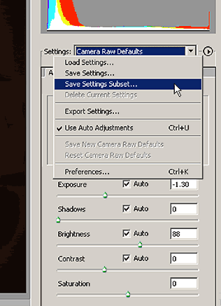
to save settings for things like a customized colour adjustment for your camera according to your tastes using the Calibrate tab. But you can save other things such as B&W conversion, cross processed effects, high contrast or ect... as well.
These setting can be quickly called up and applied to the image using the "settings" flyout tab or they will be available when you right click an image in bridge(CS2)
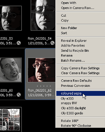
or if you are in CS ...right click and "apply camera raw settings" -then choose from the -"settings" flyout tab.
It's a real time saver if you want to quickly convert some images. These subsets can be used as-is or as a starting point for more precise adjustments afterwards.
Here's a cool one to try to start you off. I call it "Coloured Sepia"
Open an image in Camera Raw:
(ADJUST tab)
WB 43000
Tint +16
Exposure +0.55
Shadow 6
Brightness 56
Contrast +42
Saturation -80
(CALIBRATE tab)
Shadow +71
Red Hue +51
Red Saturation +65
Green Hue +7
Green Saturation -100
Blue Hue -76
Blue Saturation -20
If you like it then save the settings subset and call it "Guru Gords Coloured Sepia effect" or what ever you like. and enjoy!
Make your own and share them in the comments section.
This tip works with both CS and CS2. In Camera Raw, you can use the "Save Settings Subset..." which can be found here:
to save settings for things like a customized colour adjustment for your camera according to your tastes using the Calibrate tab. But you can save other things such as B&W conversion, cross processed effects, high contrast or ect... as well.
These setting can be quickly called up and applied to the image using the "settings" flyout tab or they will be available when you right click an image in bridge(CS2)
or if you are in CS ...right click and "apply camera raw settings" -then choose from the -"settings" flyout tab.
It's a real time saver if you want to quickly convert some images. These subsets can be used as-is or as a starting point for more precise adjustments afterwards.
Here's a cool one to try to start you off. I call it "Coloured Sepia"
Open an image in Camera Raw:
(ADJUST tab)
WB 43000
Tint +16
Exposure +0.55
Shadow 6
Brightness 56
Contrast +42
Saturation -80
(CALIBRATE tab)
Shadow +71
Red Hue +51
Red Saturation +65
Green Hue +7
Green Saturation -100
Blue Hue -76
Blue Saturation -20
If you like it then save the settings subset and call it "Guru Gords Coloured Sepia effect" or what ever you like. and enjoy!
Make your own and share them in the comments section.
Friday, February 17, 2006
removing lines
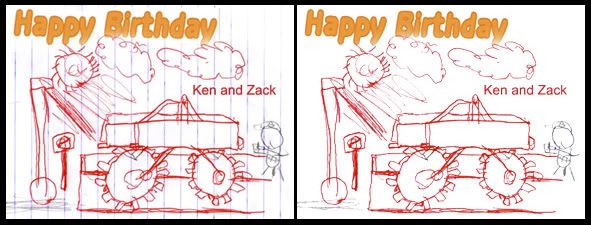
My good friend Zack's artwork for his upcoming birthday party is the inspiration for todays post.
When i saw the scan of the art i immediately thought "what would be an easy way to get rid of the papers lines".
He made it easy for me actually because he did not use blue anywhere in his drawing.
A quick scan of the channels (apple-1, apple-2, apple-2, or ctrl 1,2,3 for pc users) showed me that the blue lines dissappear in the blue channel.
Here is what i did.
- duplicate the background layer (for safety sake)
- go to the channels palette and click on the blue channel.
- drag this channel down to the create new channel box at the bottom of the palette.
- now go under image- adjust- levels (yes i know levels and not curves, just this once)
- bring the white and black sliders in towards the middle so your artworks lines show up better.
- now go to select - color range , and bring the fuzziness slider to 200.
- hit ok and inverse your selection (select - inverse).
- click back on your rgb channel (want to view them all at once) and fill with white (edit - fill - white)
- deselect and then go back to your channels palette and throw the blue channel copy in the trash (the level adjustment will throw off the color in the happy birthday text)
- lines should be gone.
- thanks Zack
Wednesday, February 15, 2006
comments
Please feel free to send comments at any time about this blog.
I was not moderating my comments and as a result the comment in the radial blur
post is not an actual comment but a link to a porn site.
I wanted to let you know so you can avoid it.
I am now moderating my comments so this will not be able to occur again.
You learn something every day.
I was not moderating my comments and as a result the comment in the radial blur
post is not an actual comment but a link to a porn site.
I wanted to let you know so you can avoid it.
I am now moderating my comments so this will not be able to occur again.
You learn something every day.
pausing an action
Peter Bauer from the NAPP help desk gave me the info for this tip today and i thought i would pass it on.
I was creating an action and assigning a function key so i could just hit the key and bam, work done.
I wanted to create a curve adjustment layer but I could not find a way to make the curves dialogue box stay open.
The action would work fine but i had to double click on the curve layer in the layers pallet to start adjusting the curve.
Heres how to make this work:
- open an image and then open your actions pallet (window - actions)
- click on the little arrow on the top right corner of this pallet
- scroll down to new action
- you can now name your action and assign it a function key, then hit record
- go to layer menu (at top of workspace) and scroll down to new adjustment layer - curves
- when the first box comes up hit ok and your curves dialogue box will open
- click ok (if you just want a unadjusted curve layer)
- now go back to the actions pallet and click stop (found at the bottom left corner of the pallet)
- If you hit the play button now (two over from where you hit stop) a curve layer will be added but will not be opened
- in the actions pallet click the "toggle dialogue on/off" box (found to the right of the check mark) next to the curve addjustment state that you created.
- this will cause the curve box to remain open when you apply the action.
- do your adjustment and hit ok.
actions are great time savers. I currently have one for rotate canvas cw, rotate ccw, smart sharpen 30%, 40%, 50%. 60%, convert to srgb, and create a 1 pixel border around my image (for passports).
Monday, February 13, 2006
channel blending
Here is a great tip for saving a weak channel.
Open an image that contains something red (ex: fall leaves, strawberries, persons face, etc.).
Take a look at the channels by using apple or alt (pc) and 1 (red), 2 (green), or 3 (blue).
You can get back to the full rgb preview by hitting apple - tilde (~).
You should notice that the reds in the image show as white in the red channel with not much detail in them.
If you look at the green channel you should see some detail and texture in these areas.
Blue usually looks quite broken up but look just to make sure.
What we are going to do is put some of this detail from the green channel into the red channel.
First duplicate the background layer (drag the background layer down to the new layer icon in the layers pallet.
Next, with the background copy layer highlighted, hit apple or alt 1 to preview the red channel.
Now go up to the image menu and down to apply image.
In the layer box choose background, in channel box choose green (because this is the channel we want to take the info from), and in the blending box choose normal (you can play with different blend modes later).
Hit ok and then hit apple - tilde to get back to the full rgb preview.
In the layers pallet change the blending mode of the background copy layer to luminosity, very important.
Then lower the opacity of that layer to 0 and bring up gradually.
You should see quite a difference in red detail.
Friday, February 10, 2006
filter settings
This is a great tip from one of the masters, scott kelby.
When using a filter (ex: i tried it on the sketch filters) and you want the settings you apply to remain (they will reset to the default settings everytime if you dont change them), just hold down the command key (mac) or the ctrl key (win) and the cancel button will change to a default button. Click default and these settings (your favourite of course) will remain until you change them again.
When using a filter (ex: i tried it on the sketch filters) and you want the settings you apply to remain (they will reset to the default settings everytime if you dont change them), just hold down the command key (mac) or the ctrl key (win) and the cancel button will change to a default button. Click default and these settings (your favourite of course) will remain until you change them again.
Wednesday, February 08, 2006
radial blur
 I was playing around again last night with a photo i had taken on the weekend and ended up with a cool effect. The first half comes to us from photoshop user magazine (dec 05) and the second half from yours truly.
Open photo you want to use. Works well with images with subject in middle of frame.
Press command - j (pc: control - j) to duplicate the background layer.
Go under filter menu, under blur, and choose radial blur.
Enter 6 for amount, choose spin for blur method, and best for quality.
Click ok to apply.
We now want to restrict the blur to where you want it.
Click on the add layer mask icon at the bottom of the layers palette.
Choose the brush tool and set foreground color to black.
Choose a medium sized soft edged brush and begin painting over the parts you dont want blurred (the girl in this photo).
This will mask out the blur. If you make a mistake and paint over something you do want blurred just hit your x on the keyboard (will put white as the forground color) and paint over what you had painted black.
Flatten the layers.
Hit command - j to duplicate the background layer again.
Choose image - adjust - desaturate.
Now hit the layer mask button again and paint in black with a low opacity (i used 24%) over the parts of the image you want the color to show through in.
Monday, February 06, 2006
straighten a photo
This is a really easy little trick.
If you want to straighten your photo, either by using an edge or a horizon line or anything in your photo, we will use the measure tool (under the eyedropper).
Just click and drag the tool along the line you want to become straight.
Let go of mouse at end of line and then go to image - rotate canvas - arbitrary, and you will notice that there is already a value set. This is the value required to make that line straight.
Hit ok and watch your image rotate.
Works every time.
using threshold
You can use threshold to find the lightest part of your image (you want the lightest part with detail, not a reflection or specular highlight) and darkest part.
This comes in handy when you use the eyedroppers in your curves dialogue box.
To do a quick correction for contrast you can use the black eyedropper to set your black (anything the same tone as the pixel you click on or darker goes to black) and use the white eyedropper to set your whites.
Before we get back to threshold heres what you should do.
Go into layer - new adjustment layer - curves. Once you are in the curves box, double click on the white eyedropper. This will bring up the options for this tool. By default it is set to pure white (255) and we want to set it to give us white with detail.
Here are the settings you should start with:
H:0, S:0, B:94, R:240, G:240, B:240, L:95, a:0, b:0, C:4, M:3, Y:3, K:0.
If you think that after using these settings your whites are not white enough just change the R, G, B, numbers higher (up to 249).
The same goes for the black eyedropper (default is 0), if you want some detail just move the R,G,B, values up between 10-20.
So now that all our options are set and we know how the eyedroppers will work we can go back to using threshold to find our lightest and darkest area.
Go to image - adjustments - threshold.
Move slider all the way to the left. Now bring it back to the right until a bit of black appears. This is the darkest part of your image. Shift - click on that part of the image to set a color sample so you will know exactly where the darkest part is.
Now move the slider all the way to the right and then bring it back until some white appears.
Shift - click in one of these areas to set another color sample.
You can now cancel out of threshold and you should see to targets on your image.
Now go to your curves dialogue box and shift - command - click on these target areas and it will set these points on your R, G , and B curves.
You can now adjust these areas.
To clear the color sample targets just go the the color sample tool (in toolbox under the eyedropper) and go up to the options bar and hit clear.
These keyboard commands were for a mac computer.
Sorry to be so long winded tonight.
Friday, February 03, 2006
apples
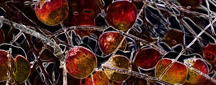
This effect was done using the find edges filter.
Here are the steps i took:
- open apple photo
- duplicate background layer
- filter - find edges
- image - adjust - invert
- select all
- change top layers blend mode to luminosity (keep opacity at 100%)
This gave me the blue apple photo.
To make the red apple photo i just desaturated the top layer.
Note: try different blend modes. Who knows what you will end up with.
Thursday, February 02, 2006
photo test
I just signed up at photobucket.com so i finally have a site where i can store my photos for this blog.
All that text was getting pretty boring.
This is just a fun orchard photo
Guru Gord
I have asked my pal "guru gord" to write a tip just for my blog.
He has agreed and is in the process of writing it.
In the meantime you should check out his blog which has some way cool stuff in it.
www.gordophoto.blogspot.com
He has agreed and is in the process of writing it.
In the meantime you should check out his blog which has some way cool stuff in it.
www.gordophoto.blogspot.com
Wednesday, February 01, 2006
reselect
Lets say you are working on an image and you spend some time making a great selection of something. You then eventually deselect and continue on with your work on the image. Lets say it really needed some work and 50 history states later your done. Or almost done. Whoops, I forgot to save that selection and now I really need it reselected to do just one more thing. Just one more i swear.
Go to your select menu and sown to reselect. Problem solved.
Just so you know I did two more corrections after I reselected, sorry.
The tips for today are by Matt Kloskowski. Say that three times fast
Go to your select menu and sown to reselect. Problem solved.
Just so you know I did two more corrections after I reselected, sorry.
The tips for today are by Matt Kloskowski. Say that three times fast
sample all layers
Want the ability to do all your retouching on a blank layer??
Create a new layer in your layers pallet.
Now with that layer (blank) selected, choose either your spot healing brush, healing brush, or clone stamp.
If you try to retouch on your new layer it will not work.
Look at the options bar for the tool you have chosen and check the box beside "sample all layers" (by default it is unchecked). You can now retouch away and have all your corrections happening on the blank layer.
The benefit you ask? You can now lower the opacity of that top layer to make the retouching look more natural.
Tuesday, January 31, 2006
russell brown movies
Not many people would know who russell brown is or for that matter have their photo taken with him (score two for me). He is crazy and wacky and i would actually not reccommend taking a course from him or sitting through one of his lectures. I would however reccommend watching some of his quicktime movies on the techniques of photoshop.
http://movielibrary.lynda.com/html/modPage.asp?ID=131
His web site can also be found at
www.russellbrown.com
Go to the first site posted here and scroll down to the photoshop cs section. I would start with the camera raw movie. If you dont already shoot exclusively in raw mode you may reconsider.
http://movielibrary.lynda.com/html/modPage.asp?ID=131
His web site can also be found at
www.russellbrown.com
Go to the first site posted here and scroll down to the photoshop cs section. I would start with the camera raw movie. If you dont already shoot exclusively in raw mode you may reconsider.
photographers link
I have long admired the work of sean kernan and just wanted to share the link.
www.seankernan.com
This would be more related to photography or web design and not so much photoshop.
www.seankernan.com
This would be more related to photography or web design and not so much photoshop.
levels clipping preview
I am confidant that no friends of mine would ever use levels to adjust contrast or color, but seeing how this blog is spreading like wildfire (1 e-mail so far), someone out there just might. This is just a very small tip for using levels to let you see when clipping (blown out highlights, or blocked up shadows) starts to occur.
While moving either the shadow or highlight sliders, hold down on the alt key (win) or the option key (mac) and you will be able to preview the clipping. If you see red in areas that means that the red channel will have no information there. If you see white or black then all three channels (red, green, and blue) are blocked up.
I use this preview approach in the camera raw dialog box but did not know that it also worked on levels.
I tried it on curves as well but no luck.
Thursday, January 26, 2006
burn and dodge
More about tool modes.
If you want to make a background white, use your dodge tool and set its mode to highlight. I usually set the strength quite low, around 18 should do the trick.
The tool will now only affect the highlight end of the scale and not the shadows.
It works well with eyes also. Run the dodge tool over the catchlights and lighter parts of the eyeball to give them some sparkle. If it makes the parts of the eye that are suppossed to be black too light just use the burn tool set to shadows to bring that part back to where it should be.
clone stamp modes
We of course have all used the clone stamp tool but have you changed the tools mode setting in the options bar. If retouching something dark like moles or bags under eyes try setting the mode to lighten. The stamp will clone out pixels that are darker than your target area. Use it on darken to get rid of shiny skin. Remember to make a duplicate layer of your background layer so you can play with the opacity of your cloned layer to make it look natural. Also remember to play with the opacity of the clone stamp tool itself in the options bar.
music link
My pal Darren has passed this awesome link along for getting some music off the net. www.pandora.com
You type in the song or artist that you like and it generates a streaming radio station for you with songs or artists that are similar to what you typed in.
This is a must try.
You type in the song or artist that you like and it generates a streaming radio station for you with songs or artists that are similar to what you typed in.
This is a must try.
Friday, January 06, 2006
Class is in
Hi.
I made this blog about a year or two ago and have yet to add something to it.
I start teaching my new class in three days. All second year photo students and all probably between a beginner to intermediate level in photoshop. The school is excellent, very creative, and the class is generally pretty keen to learn. I am looking forward to monday and am also feeling that this will be my last year of teaching.
Yes, i am going to retire at the end of this class. I would consider doing some consulting with the third years but thats about it. Im getting old you see and have to start winding down.
Anyway, enough babble to get this thing started. I am going to start this blog as a photoshop resource thing. I will be posting links to cool things and jotting down some notes on how to do other things.
Stay tuned and check back anytime.
On with the show.
Subscribe to:
Posts (Atom)