Thursday, August 14, 2008

lobster shanty

Photobucket
This is another pano from my PEI trip.
This is where we stayed with our soccer team.
Only advice is dont eat there.

Wednesday, August 13, 2008

football portrait

Photobucket
My son got his football gear tonight and a portrait was in order.
I set up a sb flash behind him and one to camera right at about 45 degrees. Both were pointed directly at him and on manual.
The image to the right is what came out of the camera.
The image to the left was achieved by first opening the image in camera raw and opening into photoshop as is.
I then opened the image into camera raw again and took the vibrance, clarity, fill light, recovery, and contrast to 100 percent.
I then took the saturation to 0, making it black and white.
I adjusted the exposure and blacks to get the photo looking how i wanted.
I opened it and then placed the original color image on top of the black and white image.
So now i have one image opened with the color top layer and the black and white bottom, or background, layer.
I clicked on the color layer to activate it and changed its blend mode to overlay.
I then took the opacity down to 62%.
I flattened the image and smart sharpened.
I then retouched the light stand using the clone tool and healing brush (just do it rough with the clone and then blend it in with the heal).
That was it.
I have two more panos in the cue for tomorrow.

another pano

Photobucket
As per my theme for the month, here is yet another pano.
This one went together fine.
I think i will look for a nice sky photo to strip in and i will post it again.

Tuesday, August 12, 2008

360 pano

Photobucket
I tried a 360 degree pano and here is how it turned out. The first frame i shot ended up being the center of the pano.

Sunday, August 10, 2008

pano month

Photobucket
It looks like it might just be pano month for me. For some reason i am enjoying playing with the photomerge feature in photoshop. This is one i shot this weekend on prince edward island while on vacation. We were at a really cool beach on panmure island.
This is a 180 degree pano stripped together in photomerge. It did not do a very good job on this one and i did a bunch of masking to correct the flaws.
If you look at this one and my last pano (alley) you will notice that i have been trying to get fairly close to my subjects so the middle of the pano looks like a point.

Thursday, August 07, 2008

overlay blending

Photobucket
I coulden't decide whether i liked this photo as it was shot or after it was run through photomatix better, so i combined the two.
I ran the image through photomatix and opened it in photoshop. I then opened the normal image and dragged the photomatix one onto it. I then duplicated the normal layer. So i now have the photomatix layer on top with two normal layers under it.
I clicked on the photomatix layer and changed the blending mode to overlay. I then merged this layer with the normal one under it. Then i lowered the opacity on this new combined layer to let the normal one under it show through until i had the look i wanted.

alley photomerge

Photobucket
I did a photo shoot last night of my niece and her three friends (late birthday present from me).
We were looking for some cool locations and found that in a downtown alley.
I thought i would try a pano using available light and above is the result.
The alley was about 7 feet wide and the wall your looking at is straight.
I took 5 photos hand held and shot vertically then stripped them together in photomerge.
I will be posting more images from the shoot later using 1 off camera flash.

Thursday, July 31, 2008

photomatix again

Photobucket
I was driving to the photo lab the other day and went past this old train station.
I had the camera in the car and thought i had better get a shot of it before it got torn down.
It was midday and the shadows were fairly blocked up. I thought it would be a perfect candidate for hdr.
I took 7 bracketed frames (bracketed by 1 stop each). I choose the normal exposure, darkest , and the lightest of the 7 frames.
I put all three images into photomatix and hit generate. I kept the strength at about 90% also as i wanted the effect to be strong.
I opened the image in photoshop and applied a curve to up the contrast just a bit, sharpened a little more and was done.

Wednesday, July 30, 2008

bracketing exposure

Photobucket
This is another shot i took while out on an excellent boat cruise.
The image as you see here looks nothing like what my eye was seeing at the time. The sun was getting close to setting but was still fairly bright. I did a few bracketed exposures to darken the clouds and sun and came up with this.
When the first shot looks lame, try something else, like bracketing.

Monday, July 28, 2008

To crop or not to crop

Photobucket
Here is a photo of a boat i took last week for fun. I was in a friends awesome cruiser and his friend pulled up along side. We were going the same speed for a couple minutes and i thought i would take a few frames. The sun was down and as a result i did not really like the color in the image. I opened the image in camera raw and did the same adjustments to it as my last few posts to bring up the contrast and detail. I took the saturation slider to -100 and opened the image. It did not look very good yet so a dramatic curves adjustment was needed. This brought up the contrast quite a bit. I sharpened the image and that was about it.
Then comes the question to crop or not. I like the balance of the above cropped photo. You will notice that most of the action and lines are toward the center of the image and the boat itself is pretty well centered. This of course would be breaking one of the rules of better photography "dont put your subject in the center of the frame but use the rule of thirds". The boat is actually on the thirds line going across, just not up and down. The crop still works however as the top of the image and the bottom, dead space on both, are equal and balance the image. Being cropped also makes the boat occupy more space in the frame.
There is no real set rule about cropping is what it comes down to. I like to try different crops until the image works for me. It usually only takes a minute and can be very well worth the time.
Photobucket

Monday, July 21, 2008

vacation

fly
I just noticed that it has been almost a month since my last post.
I have still been getting lots of visits to the site and that helps to make me feel guilty for not putting up some new info.
I have been shooting a ton of images that i will be playing with in the near future. A break was very much needed by me in all areas of my work as i was truly burnt out, thus the lack of posts to this site.
I took the photo above yesterday morning on an early walk down the beach. For the next week or so i will just post some images. I will be back to business very, very soon.
Thanks

Wednesday, June 25, 2008

flowers

Photobucket
I typically dont shoot many flowers but thought i would give it a try last night.
I played a fair amount with the images in photoshop of course after.
Mainly saturation and curves to make them look the way i wanted and then i applied a vignette using filter - distort - lens correction to darken the edges of each image separately. I sharpened about 75% and put them together on one canvas.

Tuesday, June 24, 2008

autoblend

Photobucket
I took about 6 photos of this bbq fundraiser and intended to strip them together using photomerge.
I tried and it didn't even come close to working.
I then went to my old standard which has never let me down, autostitch.
That didn't work either.
So, what now.
I thought i would try to bring all the images into one new blank canvas and see how close i could get them to where they should be. I did this and then highlighted all the layers in the layers pallate and hit edit - autoblend layers.
It actually did a fair job.
Looking at this finished photo you may be noticing all kinds of blending problems but you should have seen what photomerge and autostitch did. They just made a nasty mess, and even though auto blend was not perfect it was close enough for me on this one.
Just an idea if all else fails.

Friday, June 20, 2008

camera raw details

Photobucket
Just wanted to do another post to further explain the effect i did in my last post on the car.
In the image above you will see the original unaltered image on the left.
In the middle i took the recovery, fill light, contrast, clarity, and vibrance up to 100% in camera raw. I then lowered the saturation down to 0.
In the image on the right i left the camera raw settings the same as in the middle image but brought the saturation back up a bit to keep some color in.
I sharpened all images the same and applied the same curve to each to boost the contrast up a bit.
I like this effect but just need to experiment a bit more with it to add my own flavour.

Tuesday, June 17, 2008

camera raw effect

Photobucket
I am once again a tad bit on the busy side but had a few minutes to play tonight.
I had a flash set to each side of the car mainly to hit the headlights and then spill onto the body.
I opened the file up in camera raw and then took the clarity, fill light, recovery, and contrast sliders all the way to the right.
I took the saturation all the way to the left.
I then played with the blacks and exposure to get to the look i wanted.
I opened the image in photoshop and did a curves adjustment to further increase the contrast and sharpened the image about 100% in smart sharpen.
I got this recipe from this months issue of photoshop user magazine. I read it a few days ago and did not refer back to the book tonight while doing this image so i may have missed a few of their steps.
It is a very good issue by the way and i highly reccommend getting this latest issue.

Sunday, June 08, 2008

photomerge river

river
I took a few photos at a riverfest event today and thought i would try making a pano with photomerge in photoshop.
I usually use autostitch for this task but gave photoshop a chance on this one.
I shot 14 vertical photos handheld and overlapped each image by about half. I selected the 14 images in bridge and went under the tools menu and down to photoshop and to photomerge. I left everything set at default settings and hit ok.
Once it was done i just cropped it to get rid of the jagged edge and that was about it.

Friday, May 30, 2008

busy time

Photobucket
Just wanted to throw up a photo of a good friend of mine and let everyone know that i have not abandoned this blog.
When things slow down a bit, soon, i have some good tips to post.

Friday, May 16, 2008

happy long weekend

Photobucket
Just wanted to wish all us canadians a happy long weekend.
As you can see our neighborhood started it off tonight the right way.
A bonfire and smores, yum, yum.

Tuesday, May 13, 2008

face shoot

Photobucket
I was just bored tonight so asked my daughter if she would stand in front of my light for a sec. I was surprised when she said yes and actually managed to take about 10 frames before american idol came back on and she left me.
The main reason for me wanting to shoot was to play with a shoot through umbrella a bit more. I have been using shoot throughs for about a month now and am now officially converted. I have always hated soft boxes as i just find the light too soft, old fashioned, and to me boring. I am finding that a shoot through gives me a compromise between a reflective umbrella and a soft box and when you can get it in really close to your subject you get a nice wrap around type of light.
For the background i stuck a nikon sb flash on a stand and zoomed the head in all the way (85mm) and pointed it straight at the wall behind her, she was out about 10 feet from the wall.
Once i got the images into bridge i really liked the three images placed together. I had not planned this but thought it may work later. I was glad that i kept in the same spot for all three and just her look changed. Just never know what your going to get i guess.

Friday, May 09, 2008

off camera flash

Photobucket
I took this photo recently and thought i would post it to talk about the importance of planning your lighting. My client wanted all these people around this driving simulator and wanted the screen to show. If i had hit the scene with on camera flash the screen would have taken a hit and not looked good. I could not bounce my flash off the ceiling as it was way too high and probably would have affected the screen also. I brought a light stand, an extra flash, and two pocket wizards with me just to be safe. I usually have the car packed pretty well just in case i run into a situation where i need more equipment.
Once i saw the setup i first picked my shooting angle and then placed an off camera flash directly behind the screen and up quite high, with a pocket wizard attached. I placed a second flash on my camera which i did point straight up with the white reflector card pulled up about half way. This on camera flash provided fill on the dark side of the people, i set it lower in power compared to the off camera flash. Both were set to manual so its easy to adjust, if one is too bright just dial it down. I set my shutter speed for the driving screen, i think it was somewhere around 1/60 sec.
Now if you dont have pocket wizards dont worry. You can get a cheap optical slave for your off camera flash and your on camera flash will set it off. They dont work great outside but work very well indoors.
This type of lighting is by no means rocket science. It is actually very easy to do and really makes your photos better than the easy on camera flash only technique.

Friday, May 02, 2008

flood 2

Photobucket
I just wanted to post one more flood photo.
My small town is dealing with a flood crisis at the moment and as i mentioned in my last post i got to take a few photos of it.
I haven't been out shooting again as i have been busy with other stuff but hope to go for a stroll tonight.
I will have a good, informative , photoshop post soon, promise.

Wednesday, April 30, 2008

water rising

Photobucket
I actually did zero to this image in photoshop. I shot it for western canadian newspapers and apparently it will be the cover of the national post tomorrow.
I am more happy about the conversation i had with her, 81 year old June, than i am with the photo. We talked about the flooding of course, about her husband Karl in his rubber dingy, about their home and how long they lived there, and about eye surgery. We had the same surgeon if you can believe that. She is having trouble with her eyes and they cant seem to help her.
June was just one of those people that caught my interest right away. I have no idea why but i definately did enjoy our meeting.
This was shot for a story on our towns rising river. The water level is very high and getting higher. If you are shooting for newspapers the only tip i could give you is to include a person in the shot. Be as creative as you like but get the human element in there.

Wednesday, April 23, 2008

black and white conversion

Photobucket
I only have a few minutes tonight but wanted to get an image up that i shot a couple hours ago.
I set up two flashes for this shot. One was placed to camera left and acted as the main light. It was pretty far over, mabey at about 70 degrees. The second flash was placed to the right and just behind her a bit. I played with the shutter until the sky was where i wanted it, i think it ended up at about 1/250 sec.
I brought the image into photoshop camera raw plug in and tweaked the white balance and exposure and brought up the black slider quite a bit to make the shadows strong. It looked pretty good in color but lastly i thought i would bring the saturation slider all the way to the left to check it out in black and white. There it stayed. I felt it was a much stronger image this way.
The foreground grass and top of the sky were a bit on the light side so i duplicated my background layer first of all. Then with the top, new layer, highlighted i went to filter - distort - lens correction and applied a vignette. I made the amount quite high (slider moves to the left) and moved the midpoint to the left also to bring the darkness into the image. I then made a layer mask on this layer and painted in black over her face just to make sure that none of the vignette darkened her. I didn't paint in the mask around her feet as they were ok to go darker.
I smart sharpened about 50% with a radius of 1 and was done.

Sunday, April 20, 2008

blackandwhite

Photobucket
My son gave me another 10 minutes tonight to take his photo on his bike. He was sporting his new hair cut and my sunglasses and looked pretty cool so a photo was a must. It was close to dusk and the sky looked on the dramatic side so i grabbed two sb flashes and placed one to the left of him and one to the right. Not copy lighting mind you but more cross lighting as they were directly to his sides and not out in front of him at all. I had a pocket wizard on one and a slave on the other to trigger them.
I set the aperature for the flashes and the shutter speed for the sky behind him.
After i got it into photoshop i played with the image a bit, a curve for color correction, healing brush and clone stamp for distractions, and smart sharpen to finish it off.
I liked it in color but thought i would take a look at black and white and i really liked that approach. The sky became even more dramatic which surprised me. As you know there are many, many ways to convert an image to black and white. For this one i used image - adjustments- black and white. Once you get into this panel instead of moving the different color sliders around try just placing your curser on the image and when you left click the curser becomes a scrubby slider. So for example i placed the curser on the light part of the sky, left clicked and by dragging it to the right (or i think it was to the right) it made the sky lighter in that area. I placed the curser on the dark part of the sky and dragged the opposite direction and made those parts darker.
And so on and so on. Remember that when you click on a part of your image all areas of that color will be affected.

Monday, April 14, 2008

improvements??

scooter
I always love it when something about a photo I take interests me. When this happens it seems to stay on my mind until i can get a chance to sit down and play with it and make it even more interesting.
I shot this photo yesterday of a neighbors child as all the kids were out on the street with their new bikes. I was in front of him and his scooter (actually my daughters) and held the camera down at ground level while aiming it up at him. I had it on continuous focus and i walked forward while shooting as he made his way up the street.
I took about 10 or 15 shots of him and this was my favourite. I knew that i wanted to make the shot look a bit more dramatic and to do this i darkened the sky and road. For the sky i ran the photo through the lucis art plug in which helped a bit. I also used the burn tool set to shadows and painted (burnt) in the dark squiggles of sky that poked through the clouds. For the road i made a selection of it using both the lasso tool and quick mask mode. Once i had it selected i just applied a curve to darken it down. I actually did the sky and road adjustment on a new layer which i had converted to black and white. I then changed the blending mode of that layer to luminosity. After that i just retouched out the street light, sharpened a bit and was done.

Thursday, April 10, 2008

multiple image parts

poker2
I was reworking this image tonight as i was given some ad space in a magazine and i needed to come up with an idea for it. I ended up not using this image but thought i could at least make a post out of it.
I ran the file through the lucis art plug in twice. Once set on exposure and the second time set on wyenth. I liked the cards and chips using wyenth and the skin and body on exposure. Now just needed to combine the two and use the parts that i liked from each. If you would consider using a selection of the chips and cards and then dragging it into the other photo, well you have way too much time on your hands. Take the easy way i always say. I opened both files in photoshop and while holding the shift key down i dragged one onto the other. I then created a layer mask on the top layer and painted in black over the parts that i wanted to hide on that layer so the bottom image could show through. I had the good card and chips on the top layer so i painted over my sons body and head. Always use a nice soft brush and it will blend together quite nicely.
I find i have been doing this sort of thing alot lately.
I have shot a fair amount of group photos and the people in the front row are too bright and the people in the back are too dark. If you do a layer for the proper brightness for both the front and back and then follow the steps above you will be able to match up brightness levels very easily. Today i in fact did this exact technique. I took it a step further though and opened my image as a smart object by holding down the shift key while i was in the camera raw plug in. This will change your "open" button to "open object". Once you have it open you then go to the layer menu - smart objects - new smart object via copy. This will copy your background layer as a smart object so you can double click on either of the layers and be able to adjust them in camera raw independant of each other. If you just drag the background to the new layer icon it will not work the same. When you alter one the other will change also. Using the new smart object via copy will give you some sweet flexibility.

Sunday, April 06, 2008

ice

ice
Just wanted to put a photo up since I haven't posted in so long. I have been quite busy with real work and have not had much time for play. This is a photo i took today of a little ice sculpture i was working on. We have had tons of snow and ice this year so i have been breaking it off the driveway in very large chunks and placing it ever so carefully atop some of the snow banks. Its amazing how fast it shrinks.
I ran this photo through lucis art plug in, sharpened a fair bit and then posted.
Oh, right, there was some flaring in the sky and i used the patch tool to remove it as it was fairly large. If you haven't tried the patch tool you should. It is housed under the healing tool and works the same. After you click on the patch tool to make it your active tool you just click on your mouse button and hold it down. Draw a selection around what you want to heal and then release the mouse button. Now click your mouse somewhere inside of this selection and drag it to the part of your image that you want to heal from and let go of the mouse. Thats all it takes. If you prefer to make a selection first using any of the selection tools (marquee, lasso, etc) thats fine too. After the selection is made just highlight the patch tool and drag the selected area to the good clean area of your image so the healing can begin.

Friday, March 28, 2008

weird ideas

Photobucket
Its funny how sometimes you get these weird ideas that seem to fly into your head. Well hopefully you do and its not just that i am strange. I had not shaved this week and thought i would take a quick pic to put up on facebook. I try to do a few different self portraits for my profile and add them to go with what i am doing at the time. For this shot my plan was to get a close up of my face and have my eyes covered with my hat. Why I really dont know.
I stood looking out my back window and held the camera in my outstreched hands which ended up touching the glass in the window. Light was pretty good and shot was nice and crisp, but not crisp enough. I opened in photoshop and went straight to lucis art plug in. I chose the 4th button over from the left and moved the intensity slider to somewhere between the half and three quarter point. This brought out the detail to say the least. I retouched some of the unsightly blemishes off my mug and then sharpened the image a bit. I did a curve adjustment to get the tones where i wanted them and then cropped into a square. Some people have difficulty cropping to an exact size for some reason. To do this easily just choose the crop tool and enter the height, width, and dpi in the options bar at the top of the screen. No matter how big you draw the marquee for your crop it will always come out to be the size you entered. Just be carefull you dont make it bigger than your original was to begin with. I always check my image size first so i know i will be ok.

Wednesday, March 26, 2008

liquified leaf

leaf
This was a shot I took recently that i really liked. We were shooting with lights and the shots looked really good but the room had these massive windows with blinds in each one which looked great. Add on to this that we had a leaf display sandwiched inbetween glass and that pretty much screamed sillouette. The unedited version looked good but just needed a few tweaks in photoshop. I did a couple curves layers on it until i was happy with the darkness of the black and the lightness of the windows. I sharpened a fair bit (about 100) using smart sharpen and then did some liquify (filter - liquify) to smooth out her shirt. There were bumps along the arm and at the back of her neck where the shirt was buckled. I used the forward warp tool (top one in the toolbar) and just pushed down the bumps. After that i just retouched a black bar that ran up the windows from the top of her head to the ceiling and in front of her neck. I used the clone stamp tool for this job. Last but not least i painted in a bit more white in her eye just to create a catch light using the brush tool with the foreground color set to white.
That was it. Its always a treat to work on a photo that you like in the firstplace.
The only other thing i may do it to take out the vertical lines in the blinds. I would use the clone stamp for that task.

Thursday, March 20, 2008

night photo

skiblade
I haven't posted in awhile as i have been away and on top of that I have been extremely busy.
Things are getting caught up however and i should be good for a massive onslaught of photoshop tips very soon.
I have one in mind on how to use the liquify tool on eyes, which i have done to my last two portraits, just to pop them open a bit. I just took the photo of my son you see above about 10 minutes ago. We were playing outside and of course i ran in to get my camera, a 50mm lens, a nikon sb flash, two pocket wizards, and a light stand. I put the light to the left, and zoomed the flash head in to about 50mm just so the snow would not blast out.

Saturday, March 15, 2008

rockin in black and white

Photobucket
I stood in line this moring, early, for 45 minutes to get one of 10 guitar heros for the wii. I swore to never stand in line to spend money ever, but it was actually a rush. On the way in i actually hip checked a 10 year old boy who tried to butt in front of me, kidding of course, it was all a very civilized process.
I took a couple photos with the d300 at about 800asa and a 50mm 1.8 lens (which seems to grind very noisly now when i focus) using only available light. I put the images together, flipped the one of my daughter horizontally first, and then ran the image through lucis art plug in. I then converted to black and white by hitting desaturate (not the best way to convert remember). I then duplicated the background layer and applied a gaussian blur to it at about 4 (i made it a smaller file which is why the blur setting is low). I changed that blurry layers blend mode to multiply and lowered the opacity of the layer to around 40%. I sharpened with smart sharpen a fair bit and that was it.

Tuesday, March 11, 2008

last lucis

lucis art action
Your probably getting sick of the look already as this is the third photo I have posted with the same plug in. Time to get back to photoshop tips on the next post.

Monday, March 10, 2008

lucis art2

lucis art portrait
As promised here is another photo processed with the lucis art plug in.
In the original i could not see any detail in his eyes. Again this was overcast light only. There will be another tomorrow.

Sunday, March 09, 2008

lucis art plug in

lusic art before and after
Scott Kelby posted a blog recently where he talked about the "dave hill look" and showed how to get close by both using the camera raw plug in and another method using the lucis art plug in. I thought i would give lucis art a whirl and it is really cool to play with. You can download the demo at www.lucisart.com
I used the whyenth effect which enhances detail in your image by manipulating pixel contrasts. Looks like an hdr thing to me.
The above photo shows before and after.
Most people say that you must have the right lighting for this effect to really work. Contrasty light is the requirement so they say. The above example was shot outside under a very overcast sky, certainly not high in contrast. I think the effect worked very well on this image.
I will post more images over the next couple days.

Thursday, February 28, 2008

arena pano

arena pano
Wow, two post in one day. My wife has however reminded me that i should be doing real work and as usual she is right, so two is it for today (ha).
This shot is made up of 49 seperate images. All were shot hand held also. There was more foreground and ceiling in the final composite but i cropped it in a fair bit. This allowed me to keep the celindrical feeling but let the court occupy a larger space in the image.
I started by using autostitch (www.autostitch.net) to create the pano. I then did some retouching as there were about 10 people on the court that i wanted removed.
I duplicated my background layer and turned it to black and white so i had the black and white layer and a color one underneath. I put a layer mask on the top layer and painted in black on it to allow the color court to show through while keeping the rest of the layer in black and white. I sharpened it up a fair bit and i think that was it.
Now back to some real work, or off to bed, well see.

faceit fun

Photobucket
I had to do a studio shoot today of a lady and grabbed a friend of mine to stand in so i could test the light. I composed and shot this image as you see it on the left half of the photo. I used a large softbox quite close to him for the light which is very untypical for me. It was set up (thanks joy) and i just didn't feel like changing it.
Anyway, i liked this image and liked it even better after i had some fun with it. I just created another canvas of the same size (select your original canvas and go to edit - copy, then when you go to file - new the size will already be there for you so you can keep it the same), and went to image - rotate canvas - flip horizontal. I then expanded the canvas size of the original and while holding the shift key dragged the new flipped image onto the original. I slid it over , put a border on it, cropped off the excess and was done.

Wednesday, February 20, 2008

smart objects win everytime

poker
We had a little fun game of poker tonight and while the chips were still down i bravely asked the question to my son, "hey, do you mind if i take a quick shot". You never know how that ones going to go but tonight it was a yes. I knew i had about 1 minute so i quickly grabbed a flash, threw a pocket wizard on it and one on the camera, set the camera on self timer and set it on the table with the lens propped up on a stack of poker chips. I hand held the flash just over his head and pointed straight down at him and the chips. I really liked the shot in camera but his hair and the chips were a bit too bright and his face was a bit dark. Into photoshop we go.
I opened the raw file in camera raw and set the exposure for his face. I held down the shift key which changed the "open image" button to "open object". I opened it as a smart object and then when back into bridge and opened the same raw file again but this time adjusted the exposure for the hair and chips (much darker overall than the first one). I again held down the shift key and hit "open object". Once both versions were open i combined them into one by holding the shift key down and dragging one onto the other. Next i blended them together by using a layer mask on the top layer. My top layer was the dark image so i painted in black on the layer mask over his face and cards to see through to the brighter layer underneath.
I ended up tweeking the brightness of both layers by double clicking on the layer which, because they were smart objects, brought me into the camera raw plug in again.
I flattened the layers at the end, retouched a bit, and then sharpened.
My sharpening technique this time was to go under image - mode and convert the rgb file to lab. Once in the lab color space i went into my channels pallate and clicked on the lightness channel. I applied an unsharp mask at an amount of 270, radius 1, and threshold of 5. I then went back to image - mode and clicked on rgb to change back the my original color space. Sharpening this way will affect your textures but not your color.
Oh, and to cap the image off i went under image - adjustments - hue/saturation and added about +12 saturation.

Monday, February 18, 2008

door removal

Photobucket
Above is the finished version of this team photo. Well almost finished. I have another version where i sharpened and burnt (midtones) down the faces and front row a bit. I also did a curve to put a bit of magenta in the shadows and a bit of blue in the midtones. Below you will find the raw file right out of the camera.
As you will notice, the background was a little distracting. I decided to remove the door and banners as well as the exit signs and pipes on the walls.
To do this i just duplicated the background layer and did all my retouching on the background copy. I used the clone stamp to cover over the door with parts of the wall. I went right over the players heads that were close to it so i knew it was all removed. This took a bit of time as it was hard to make the lines on the wall line up. I also used the healing tool to get what i needed. When i had the door and banners and everything else removed i then duplicated the background layer once more. I put my retouched layer in between the background and the second background copy. So now when you look at the image you see the not retouched version. I added a layer mask and paint in black over the door and other things that i removed. This let the retouched layer show through wherever i painted in black.
I flattened the file when i was done and added a vignette to darken the edges a bit. I also used my burn tool set to midtones and about 10% strength to go around the edges a little more. Below is the original photo.
Photobucket

Friday, February 15, 2008

snow day

Photobucket
All it has done this winter is snow. I have been looking around and thinking, that would make a good photo, that would make a good photo, etc, etc. I walked outside my work building today and decided to finally take a winter shot.
Not much of a shot really but thought i would post it just the same.
I converted it to black and white by going to image - adjustments - black and white.
I hit ok and then went into edit - fade and faded my black and white conversion to 85% so just a hint of color would be left in.
Sharpened and saved.
Have a great weekend.

Monday, February 11, 2008

hdr combo

Photobucket
The above image was shot in a very dark arena (turned into a convention room). I photographed the event and then at the end, when the premier was speaking, I took my tripod to the back of the rink and bracketed over a 7 stop range.
On the normal exposure for the crowd, the speaker and screens were blown out. Normal for the speaker put the crowd way too dark. It took way over exposing both to bring up the red you see on the curtains as they were just these little led lights.
Another perfect candidate for photomatix.
Photomatix did a very good job at getting the entire image close but where the crowd moved a bit they got a little funky. Also the speaker and screens were still a bit light. To fix this i opened the photomatix tonemapped image, one of the original exposures where the stage was properly exposed, and one where the crowd was properly exposed, in photoshop. I used the photomatix image as my background and then using the move tool and holding the shift key down i dragged the other two images, one at a time, onto this background image. I created a layer mask on both of the top two layers and filled them with black to hide all of those layers allowing only the background to show through. I then painted in white on the layer mask to reveal the stage on one layer and the crowd on the other. Make sure you use a really soft edged brush so it blends in well.
This is an extremely easy task as layer masks could not be easier. If you make a mistake just paint over your troubled area in black and it is fixed.
Oh, and if your showing a friend your final version make sure that you leave your layers pallate open so they can see all your layers and masks. Its impressive to someone who doesn't know much about photoshop (ha).

Sunday, February 03, 2008

photomerge

Photobucket
Sorry for my absence. I have had a very busy january, which while is very good, has kept me off the computer having fun.
The photo above is of a local bakery. If you are local or are visiting fredericton then go to the happy baker. Great coffee and even better baked goods.
Anyway, the store and bakery occupy a narrow long space which was very difficult to capture in one shot. I put the camera on a tripod and took 4 or 5 vertical shots (sorry cant remember exactly)to cover the whole store. I opened bridge and selected the shots i wanted stripped together and then went up to tools - photoshop - photomerge. I was very surprised at how good a job it did. It was way better than in cs2. The only problem i had was that there was a blurry guy at the back of the store. When photomerge creates your pano however, it uses layer masks, so if you dont like something (like the blurry guy) then you can just paint in white on that part of the layer mask and remove him (he was only in one frame not all).
I retouched and removed some distractions and sharpened a bit.
The only other thing i had to do is fix up the carpet as there was alot of white flour tracks in it. I first selected the whole carpet using the lasso tool and refined the selection using quick mask. It took awhile but looked great. I saved this selection to bring it up again later. I duplicated my background layer and then sampled a nice dark brown from the carpet itself and loaded the selection I created earlier. I then filled the selection with this brown color. I lowered the opacity of this top layer so some of the texture would show through and was pretty well done.

Tuesday, January 15, 2008

shoot for the dogs

dogs
This is not really a photoshop tip post but instead an insight into a shoot post.
I was asked to photograph this girl with her two dogs. Simple enough. Start early in the morning so the light is low, get them walking towards me, sun to the left at 45 degrees and take lots of photos with a long lens and shallow depth of field. Recipe for success in most cases. We met and started shooting on a long walking bridge but the side rails cast some pretty severe shadows and although she was perfectly lit the dogs were in shadow. The wind was very strong also and it was wreaking havoc on her hair. Next recipe please.
Time to head to a cool building with a very nice deck and large white wooden chairs. Throw in a couple nikon sb flash unit, like any strobist would, one to the back left for rim light and one to the front right (at about 45 degrees or more) for main light. I own two pocket wizards so i put one on the camera, one on the main light, and put a wein slave on the back light. I then crossed my fingers and hoped it wasn't too bright out for the wein. It worked, yea hoo. I placed my human subject in the chair and then it was time to bring in the dogs. Funny thing was that the dogs really didn't want to be there. They wanted to instead run and play. We must have brought them back under my light setup 20 times and they would last about two frames and that was it, time to roam.
Luckily i inherited a tremendous amount of patience from my father so i could have shot like this all day. I knew it was time for the shoot to end however when mild frostbite set into my fingers.
I did end up shooting about 100 frames but this was my favourite. I think its because it shows a little bit of our struggle.
When the dogs were leaving i could have sworn that i saw one give the other a high five and wink.

Thursday, January 10, 2008

Black and white with blur

Photobucket
I was playing in lightroom tonight and had a chance to take a second look at some images i shot recently.
I was playing with a landscape photo and trying a couple different things (i will post it at the bottom) and thought i would try the effect i came up with on a face. I think i like it better on a landscape but anyway here it is.
First off i opened a color photo of gord and converted it to black and white by going to image - adjustments - black and white.
In the panel that opens i played a bit with the sliders to try to make the image look a bit infared. I moved the red slider to the right and the blue to the left a bit.
I then wanted to blur most everything except his eyes and what was along the horizontal path of his eyes. I duplicated the background layer and clicked on the eye icon to the left of this new copied layer to hide it. On the background layer i then went to filter - blur - lens blur and cranked the radius up to about 55. Quite blurry. I clicked on the top layers eye again to show it and then added a layer mask to that top layer. I selected the gradient tool and used the celindrical shape in the options palatte (4th icon over). I made sure my forground color was black and background white and then clicked at his eye level and dragged the mouse to about his chin. I played with this a bit till i got it right. I then chose my paint brush and painted a bit in black to the left and right of the face on the background.
I smart sharpened and did a slight curve to increase contrast and was done.
Photobucket

Wednesday, January 09, 2008

zamboni

Photobucket
I was asked to take a shot of this zamboni to be put on a certificate to "win a ride on a zamboni at a hockey game".
I certainly could have taken a very standard, boring shot of the thing and they would have been more than happy.
As i already mentioned however, that would be very boring.
Time to have some fun.
I bracketed over a 7 stop range and picked out a very dark exposure, an average exposure, and a very light exposure.
I processed these three images in photomatix (I know, I know. Is this photoshop2 or photomatix2) to get a result i liked.
I then opened that image in photoshop and duplicated the background layer. I left the top layer (copy) in color and desaturated the background (lower) layer. I then created a layer mask (icon at the bottom of the layers palatte) on my top layer. I used a soft edged paint brush with black as the foreground color and painted in the mask over the background. That allowed the black and white layer under the color layer to show through. I carefully painted until no more color was on the background, behind the zamboni.
I then wanted to bring some of the color back into the background (just a bit) so it wasn't completely black and white. I duplicated the black and white layer and the color layer each one more time. What i am trying to end up with is: very top layer being color with the mask on it, next layer down is black and white, next layer down is color, and next layer down (background) is black and white. This very bottom, or background, does not matter. We are really not going to see past the layer above it.
What you will need to do now however is drag mask from the lower color layer to the trash. Just click on it and drag to the trash can at the bottom of the layers pallate and hit delete when the box pops up.
You can now lower the opacity on the uppermost black and white layer to your liking. This will allow some color from the color layer under it to show through.
I flattened the image and retouched it. A heavy smart sharpen, a slight curves adjustment and it was done.
Below is the original.
I will be starting a post tomorrow on how to shoot a team photo and leave a space for someone who is missing and then add him in later. There is alot to this next post so i will do a part of it each day for a week or so.
Stay tuned.
Photobucket

Monday, January 07, 2008

single image in photomatix

Photobucket
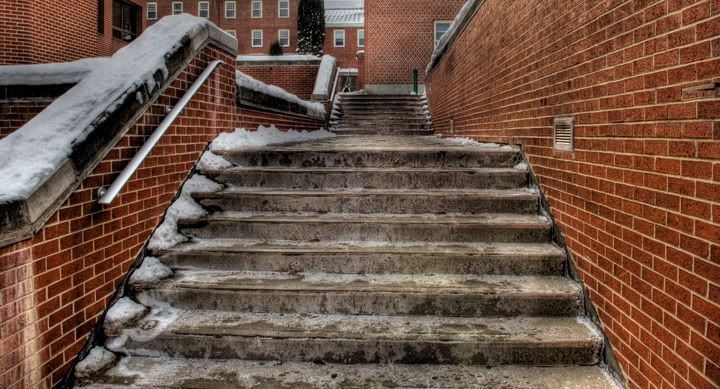
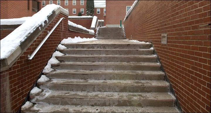
I finally figured out today how to process one image in photomatix pro.
The above photo is the finished result and the original image is below.
I love what it does to brick and concrete but really dont like what it does to snow.
I also tried this technique on a family studio portrait and it was amazing how much detail it brought out.
Technique:
- I placed one jpeg into a folder on my desktop.
- In photomatix go to Automate - batch processing.
- Make sure the two boxes (generate hdr image and process with details enhancer) are checked.
- Make sure that ALL is selected in the box in front of "images at a time".
- In location - choose navigate to your folder with the one image in it.
- Hit run.
- It will tell you when its all done.
- Go to your folder that you chose and inside of it will be a new folder called results.
- Open that and drag the hdr image file onto photomatix to open it. (or of course go into photomatix and navigate to that file and hit open).
- Next in photomatix go to HDR - tone mapping.
- You are now ready to play with sliders.
The settings i used for this image are : strength - 100, color saturation - 60, light smoothing - high, luminosity - +7, and the white and black sliders were up quite a bit.
I later sharpened it in photoshop and did a curve to increase the contrast a bit ( i did these same corrections to the original image file below).
Note: you can also play with the settings in the first batch processing window. You will see a settings box just after the details enhancer check box.
Photobucket