Saturday, January 31, 2009
just some harmless fun
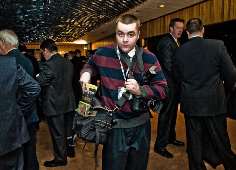
I was shooting an event recently and the media was covering the event pretty heavily. That means that i had some friends there shooting. Its always fun trying to get funny shots of your friends in these situations.
I opened this image and did my sliders thing in camera raw and also added more clarity with the adjustment brush. I then went online looking for an image of "photography for dummies" that i could strip into his notepad. I went under edit - transform and used the skew, and warp tools to make the cover fit. I created a layer mask to allow his fingers to show through and hide the book to make it look like its going into his bag.
Wednesday, January 28, 2009
100% clarity and then some
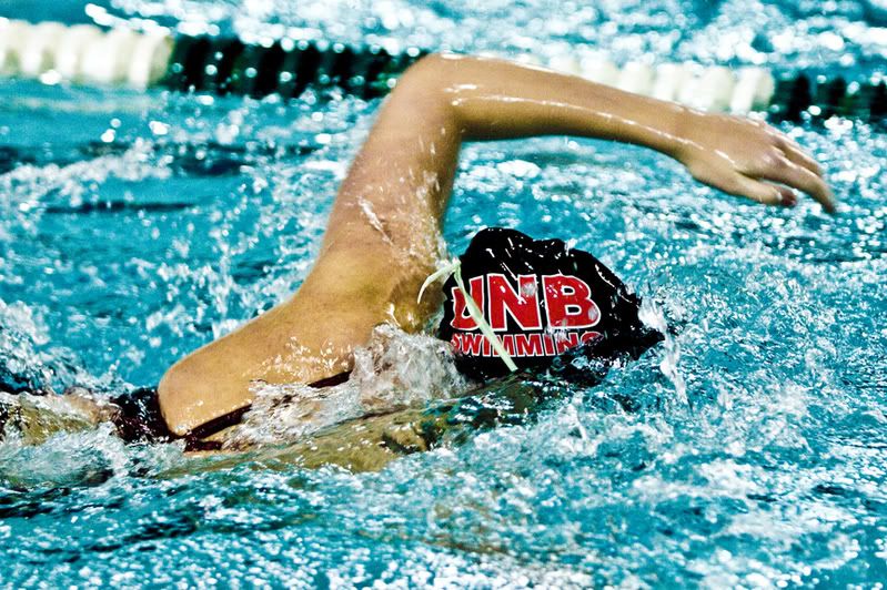
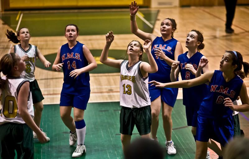
Here are a couple sports shots i took last week that i had some fun playing with.
I opened both in camera raw and cranked the clarity up to 100%. I made the other adjustments with the various sliders to get the right exposure, blacks, etc. I read in the current version on photoshop magazine that you can add more clarity when 100% isnt enough by clicking on the adjustment brush in the camera raw tool pallate at the top of the window. A new bunch of sliders will appear to the right of the screen and you just slide the clarity in this new window up to 100%. Then make the brush nice and big and paint over the whole image, or the parts of the image that you want more clarity in. To exit this mode just select another brush at the top of the camera raw plug in and you will see your original sliders again.
Monday, January 26, 2009
fake model scene
I said that i would post a fake model scene and i stuck to it.
Not sure that i love it but that is besides the point.
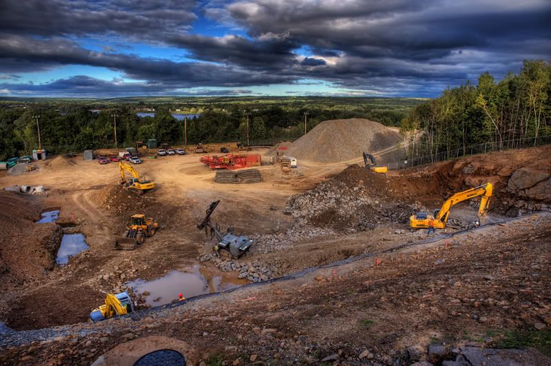
I think i actually like the original, or something like that, below. I will talk mostly about this bottom image as you can just take any photo and follow the tutorial i listed the link to in my last post and have this effect.
The image below is made up of three images which i ran through photomatix. I ended up with an image that was a good look for the ground but the sky was too light. I ran the three images through photomatix again and this time make the sky look better. I opened both photos in photoshop and drug one on top of the other while holding down the shift key. This gave me the good sky on top and the good ground as a background. I added a layer mask to the top layer and masked out the ground so that the proper exposure from below shone through. I added some saturation, sharpened, and burned in the sides of the image a bit to make the middle stand out. I also used the dodge tool set to highlights to add some bright spots to some of the scene, mostly some of the trees and equipment.
Photomatix really did a great job on this photo.
This image was shot with a d700 and a 24mm lens by the way.
Friday, January 23, 2009
using selective blur
Just a quick post tonight before i hit the hay.
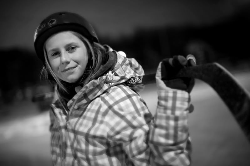
We did a little skating tonight and i just so happened to have my camera in the car. This was shot with natural light which was provided by some very dim street lights around the outdoor rink. I shot at 1600asa and used a 50mm lens set to 1.4 with a shutter speed of 1/20sec.
I opened the image in camera raw and adjusted it mainly for the jacket and background which made the face and sky go too dark. I hit open and then went back to bridge again and reopened the image in camera raw. This time i adjusted for the face and sky and hit open again. I drug the light version on top of the dark version and then applied a layer mask to blend the two exposures together how i wanted them. Do this slowly with like a 40% opacity on the brush.
I then flattened and duplicated the background layer.
From here i am going to direct you to the internet for the tutorial that i used for the blurring effect.
http://www.recedinghairline.co.uk/tutorials/fakemodel/
After i had the blur the way i wanted it i added a layer mask to the top layer and painted over the face and collar a bit to make sure the sharp image from below was showing through. I flattened the file again and sharpened it. I then went to filter - distort - lens correction and added a vignette.
One more note, i converted to black and white in camera raw at the first.
I applied a curve as a last step to bring up the whites a bit.
My next post will be using the technique i posted the link for above to make an image look like a fake model.
Thursday, January 22, 2009
photomatix and original image blend
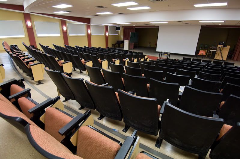
Above is the original image, shot in raw, processed in camera raw plug in and then saved.
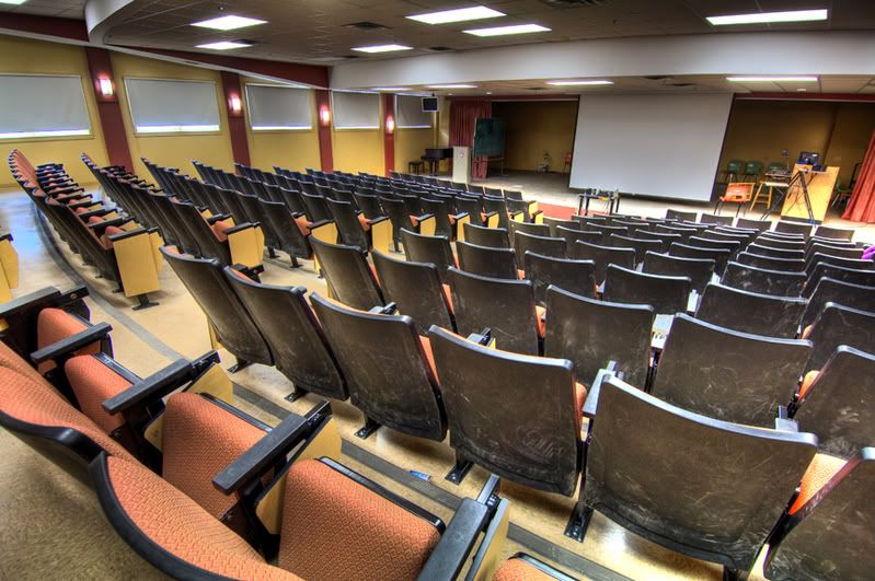
This second image was made from three different exposures, one dark, one middle, and one light, which were then run through photomatix and saved.
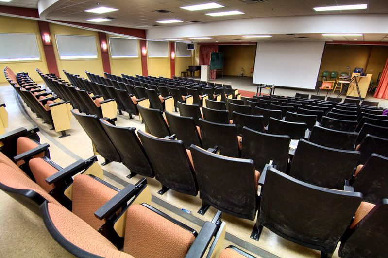
This last image was made by opening both the original (top) photo and the photomatix (middle) photo and dragging one onto the other so i ended up with one image that contained two layers. I of course held the shift key down so they would line up right. One more note is that i used a tripod on this shoot.
Before i get too far i should mention the "why" bother doing all this. I liked the photomatix image but just not the chairs as it really showed up every mark on the backs of them. I also felt the ceiling was just a bit dark.
With the one image opened and containing the two layers i then created a mask on the top layer, lets say that it is the photomatix image that is on top and the original on bottom. I painted in black on the mask over the chairs at an opacity of about 45% which i then just redid until i had them pretty well covered in black on the mask and the original below showed through clearly. I lowered the opacity of the brush to about 20% and painted over the dark part of the ceiling.
I think this was all i did on this one. Just realize that you have to change your brush size ([ key for smaller and ] key for bigger) when painting in your mask so you dont get spill on areas that you dont want masked. I also use a brush with a hardness of 0.
When checking out the differences in the photos take a look at the wall behind the stage. Much nicer in the photomatix and blended photo compared to the original. I thought all the walls looked better, the windows were better, lights better, and ceiling better.
Thursday, January 15, 2009
reason for raw
I of course realize that everyone out there, especially those of you that follow my blog, is shooting in raw mode. Not because you get thousands more levels of grey and that you end up with an umcompressed image file but because i suggested that this is the mode that you should use. Ha. That was an attempt at humor.
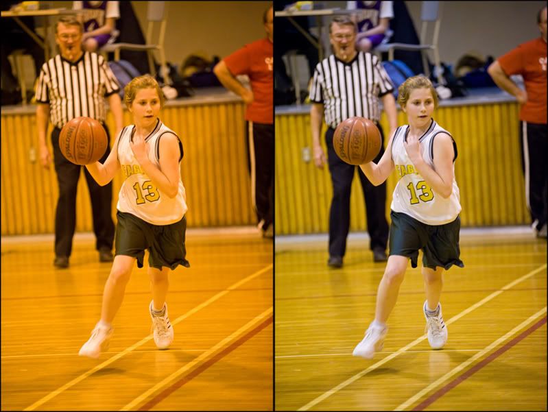
Ok, i was shooting in a horrible gym tonight, lighting wise anyway. None of my white balance settings came even close so i set the camera to "degrees kelvin" and set it to the lowest number it goes to, i think it was 2500 degrees k. The photo you see above on the left is what that looked like. I only opened the image photoshop, shrank the image size and saved it. So, if i was shooting jpegs this is the file i would be faced with color correcting using either levels or curves. If i took 200 photos during that game i could fix the first image and then drag its curve over onto all the other images, which i would have to open in photoshop and then flatten and save. Or make an action and do a batch.
The image on the right was corrected in the camera raw plug in very easily by using the white balance tool and clicking on part of the white uniform. I did a few more slider tweeks like raise up the recovery slider and the blacks while lowering the exposure. I could then just select all my other photos in the camera raw plug in and hit the synchronize button and then the done button. I could have my 200 images color corrected faster that you could read this blog post.
For a little added info, i was shooting on a d700 set at iso 3200 with an 80-200 f2.8 lens. The exposure was 1/180sec at f2.8.
Thursday, January 01, 2009
Direct the Eye
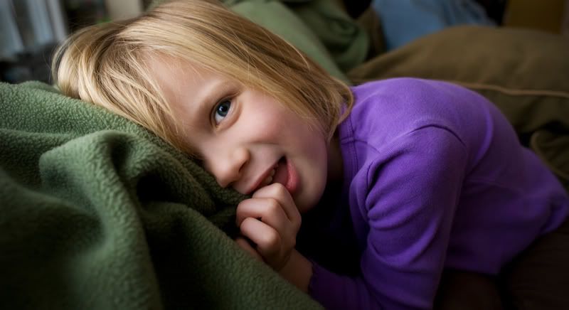
2009 is here and with it comes this photo that i took approximately 12 hours ago which i really, really, really, like.
It always amazes me how some shots stand out and grab center stage with both hands, to me anyway. Often times i wont even know what it is about a photo that has moved me until i take a real close look at it and dig in. Sometimes its the lighting, composition, coloring, emotion, etc, etc. A photo can grab you with only one of these all by itself or by a combination and often times it really does take a minute to figure it out.
This photo started for me with the light. My neighbor was just playing around on the couch with my cat phoebie. The light coming in from a large window to her left was beautiful so of course i said "would you like me to take your picture"? I put a 24mm lens on as i wanted to get nice and close so her face would be powerful in the frame but I could also take in some of the background. She looked out the window for a bit, then stuck her tounge out for awhile, and then got a little shy and started to cuddle the blanket on the back of the couch. I liked the other photos as well but this one was the magic.
In photoshop i did alot. The photo looked great right out of the camera and most of the things i did to it were very subtle but very much needed.
I started by figuring out a crop. This was not easy. I tried a square, then a loose, then a tight, and ended up with this. I did a fair amount of retouching next using the heal and clone tools. There was a hair that went right through her eyeball which i took out as well as some other little distractions. I wanted the viewer to be able to really look at that big eye, study it, think about what was going behind it, and then move on the the rest of the image when ready. To help the eye be more powerful i used the dodge tool set to highlights (10%) and dodged the eyeball. I also used the burn tool set to shadows (4%) and hit it once with that. When you do a before and after view of this effect it is amazing how much it helps the eye. Since it had a nice shade of blue i also used the sponge tool set to saturate on the colored part of the eye a little bit.
I then duplicated my background layer and added a vignette with the filter - distort - lens correction method. I wanted to have the center of the image pop and the background to not have any impact. I then created a layer mask and painted in black over the center of the image to make sure the vignette was not darkening it down and dulling the face. You will also notice that you can really bring out subtle parts of the image by painting in the mask with a lower opacity (40%). I wanted the thin green pillow behind her to act as a bit of a rim for the hair so the vignette darkened the outside and i brought the inside back with the mask.
I also wanted the background blurred a bit more so i duplicated the background layer again and then held the option key and drug the mask from my top layer to my new layer. This just copied the mask so that i now had it on both of my top two layers. I used lens blur and blurred it a fair amount.
I then just did a curve to darken the image down a bit in the three quarter tones and brought the highlights up a bit, used smart sharpen and was done.
If i could give anyone one piece of advice it would be the following. Play with the image in photoshop all you want but in the end make sure that none of your work can be noticed. For example, if i had lightened up the white of the eye any more it would have stuck out like a sore thumb. All your hard work has to look natural.
Subscribe to:
Posts (Atom)