these are links from the 2006 pdn photo annual from the best web sites section:
www.hanskristianriise.com
www.stevenlippman.com
www.joshrothstein.com
www.ba-reps.com
www.brendakenneally.com/theblock
www.chasejarvis.com
www.stocklandmartel.com/smart_book/2005
www.jefftse.com
www.garryowens.com
www.craigsherodphoto.com
www.marvilacar.com
www.nathanperkel.com
www.benjaminkrain.com
www.andreafazzari.com
www.feinknopf.com
www.allisonvsmith.com
www.matthewstylianou.com
www.glanger.com
www.oculi.com.au
www.dananeibert.com
www.bobbifabian.com
www.seanmurphyphoto.com
www.3am.net
www.jeremycowart.com
www.zizola.com
www.reena-adam.com
www.TogashiStudio.com
www.jamesdayphoto.com
www.mediastorm.org
www.mitchrangerphotography.com
www.noelletheard.com
www.grunertimaging.com
www.jefflipsky.com
www.reneeritchiephoto.com
www.flotowarner.com
www.LifeShots.co.uk
Sunday, May 28, 2006

dodge white backgrounds
I do a great deal of portraits on a white background and making that background white is difficult with lighting. You could set your background light to two stops brighter than your main light but this also usually produces flare or interferes in some way with your subject. I dont worry too much about this because i have a dodge tool in photoshop that works quite well. Set the tools mode to highlights in its option bar and the strength quite low (10 - 18). Use a nice soft brush, not too small, and go over the white areas of your background. It should not affect your subject unless they too are wearing white.
Saturday, May 27, 2006
weak channels
This is a great tip for weak color channels. For example, if you shoot something red (flowers for example) you will notice that you dont see any detail in the reds. Heres how to fix that.
Step 1: go to your channels window and click on the red, green, and blue channel seperately (or use ctrl 1,2,3 and the tilde key to get back to rgb).
If a channel is weak you will see alot of white and no detail.
Step 2: choose the channel that the detail looks best in. For weak reds the green channel is usually the best.
Step 3: go to window - layers and duplicate the background layer.
Step 4: highlight the background copy layer and click on the weak channel in the channels palette. You should now be viewing the background copys red channel for example.
Step 5: go to image - apply image.
Step 6: here is what you want the settings to be in the apply image box.
layer - background
channel - green (or whatever channel had the best detail in it)
blending - normal
opacity - 100%
Step 7: hit ok.
Step 8: go to your layers palette and change the blending mode of your background copy layer from normal to luminosity.
Step 9: make sure in the channels palette you are on rgb (you want to be viewing all the colors)
Step 10: lower opacity of the background copys layer till it looks good.
note: you could always make an action of this to use in your workflow.
Step 1: go to your channels window and click on the red, green, and blue channel seperately (or use ctrl 1,2,3 and the tilde key to get back to rgb).
If a channel is weak you will see alot of white and no detail.
Step 2: choose the channel that the detail looks best in. For weak reds the green channel is usually the best.
Step 3: go to window - layers and duplicate the background layer.
Step 4: highlight the background copy layer and click on the weak channel in the channels palette. You should now be viewing the background copys red channel for example.
Step 5: go to image - apply image.
Step 6: here is what you want the settings to be in the apply image box.
layer - background
channel - green (or whatever channel had the best detail in it)
blending - normal
opacity - 100%
Step 7: hit ok.
Step 8: go to your layers palette and change the blending mode of your background copy layer from normal to luminosity.
Step 9: make sure in the channels palette you are on rgb (you want to be viewing all the colors)
Step 10: lower opacity of the background copys layer till it looks good.
note: you could always make an action of this to use in your workflow.
Friday, May 12, 2006
city hall show
To my former photoshop students, great job on your city hall show.
I was there today dropping off an invoice and out of the corner of my eye saw rebekah staring at me (her portrait that is). If it were really rebekah in person i would probably still be there talking (just kidding rebekah).
Quite honestly i did not expect to be as impressed as i was. It looked very professional and the images were very well chosen. Congratulations.
I was there today dropping off an invoice and out of the corner of my eye saw rebekah staring at me (her portrait that is). If it were really rebekah in person i would probably still be there talking (just kidding rebekah).
Quite honestly i did not expect to be as impressed as i was. It looked very professional and the images were very well chosen. Congratulations.
ocean in color
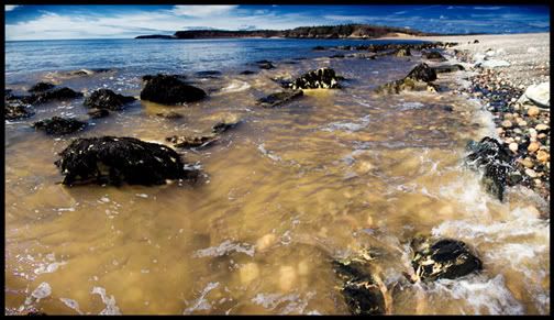
just wanted to post the color version.
I used the same technique that i did with the cat.
Thursday, May 11, 2006
color space for web photos
See, back already.
When you post images to the web or send them to a 1 hour lab for printing, make sure that they are in the srgb color space. If you are shooting in raw just make sure that the space in the bottom of the camera raw dialogue box is set to srgb. If you have a file in the rgb 98 color space just go to the edit drop down menu - convert to profile - destination space - srgb. Just do a comparison and you will see the difference.
I am not saying by the way to never use the rgb 98 space as that is what i use the most. It has a greater range than the srgb space. I use it for photos that will be seen on my monitor or photos that i will print locally (ink jet printer in office).
When you post images to the web or send them to a 1 hour lab for printing, make sure that they are in the srgb color space. If you are shooting in raw just make sure that the space in the bottom of the camera raw dialogue box is set to srgb. If you have a file in the rgb 98 color space just go to the edit drop down menu - convert to profile - destination space - srgb. Just do a comparison and you will see the difference.
I am not saying by the way to never use the rgb 98 space as that is what i use the most. It has a greater range than the srgb space. I use it for photos that will be seen on my monitor or photos that i will print locally (ink jet printer in office).
photographers site
sorry for the slowdown in posts.
I have been preoccupied by photography lately.
My thoughts and efforts have been dedicated to photoshop for years now but recently i have become interested once again with lighting and overall photography. I will still be updating this blog with photoshop stuff regularly and cool photos. Keep watching. The main reason for this post was not to talk about my thoughts but to give you a link to a bunch of photographers work.
http://www.ba-reps.com/list/photographer
Be back soon.
I have been preoccupied by photography lately.
My thoughts and efforts have been dedicated to photoshop for years now but recently i have become interested once again with lighting and overall photography. I will still be updating this blog with photoshop stuff regularly and cool photos. Keep watching. The main reason for this post was not to talk about my thoughts but to give you a link to a bunch of photographers work.
http://www.ba-reps.com/list/photographer
Be back soon.
Saturday, May 06, 2006
cool effect
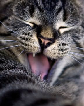
This is Fred.
Ok, now that introductions are over what did i do to the photo. I have been playing with an effect (all mine so far as i can tell) that messes with the color and depth of the image a wee bit.
First i duplicated the background layer and highlighted the background copy in the layers pallete. I went under the image menu and down to adjustments - channel mixer. I clicked on monochrome at the bottom and then slid the red channel all the way to the right, took the blue quite far to the left (not all the way), and then the green to the right just till it looks right. I hit ok and then in the layers pallete changed that layers mode to luminosity. I lowered the opacity to about 80%, added a curves adjustment layer to boost the contrast, added a saturation layer adjustment to boost the saturation and ended by smart sharpening. I recorded all of the steps (not the curve and sat layers) in an action and can now use it on other images quite quickly.
Thursday, May 04, 2006
ocean 2
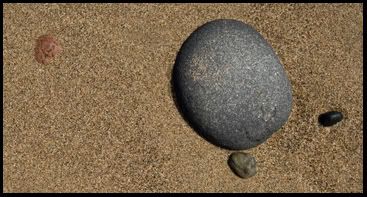
I am waiting for my 350 images to download that i shot tonight and thought i could take a minute to post another ocean trip photo. All i did to this one in photoshop was crop and sharpen. Also my friend noel would be proud of me as this is a found shot and was not altered while being photographed.
Wednesday, May 03, 2006
ocean black and white
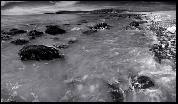
I had a few minutes after a shoot today and thought i would do a little fun shooting and get a bit of sun. In the short time i was there i came away with about 5 seperate images that i liked. This image was of course 3 seperate photos stitched together. My stitching software and photoshop photomerge did not work at all on this project so i had to do it manually with the help of layer masks. I made a mask on the center photo and then applied a gradient to one side to blend into the background image. I then had to do the other side and that was even more fun. I copied the layer with the mask on it and held the ctrl key while i clicked on the layer mask. This gave me a selection of where my mask was. I inverted the selection and hit the delete key which got rid of part of the image on that layer.
I then place the layer mask in the trash and made another one. This time i used a gradient in the mask but applied it to the other edge of the layer to blend that side. I then sharpened the file and converted it to black and white in channel mixer. I put the red channel all the way to the right and moved the blue channel quite far to the left. I used the green channel to lighten it up a bit in the midtones. A little border and done.
I will post another tomorrow with much fewer photoshop steps.
Thursday, April 27, 2006
adding image size
I have a job coming up and my client needs a high res file to print 11x17 for a calendar.
No problem. At least thats what i tell them. They dont know that my camera will only capture a file that is 15x10 at 200dpi.
I tried some tests to see how best to add two inches to the height while keeping the dpi at 200.
I tried 4 different methods and its quite hard to tell the difference in a print between them.
What i kept similar in all of them was the way i scaled up two inches. I created an action and went to image - image size.
I went up in half inch increments and changed the mode at the bottom to bicubic smoother each time until i got to 17 inches. This means that yes i went into image size four times and hit ok after each half inch addition. Where i modified the other steps was in the sharpening. I tried sharpening first then upsizing, tried upsizing then sharpening, and lastly tried opening my raw file as a 16 bit prophoto file, upsizing, sharpening, converting to adobe rgb98, mode to 8 bit. For all the extra effort i cant really tell a difference. The file that looked the worst however was the one i sharpened first then upsized.
I now have the word out to sell my d70 camera and am ordering a d200 very soon. Dont tell my wife.
No problem. At least thats what i tell them. They dont know that my camera will only capture a file that is 15x10 at 200dpi.
I tried some tests to see how best to add two inches to the height while keeping the dpi at 200.
I tried 4 different methods and its quite hard to tell the difference in a print between them.
What i kept similar in all of them was the way i scaled up two inches. I created an action and went to image - image size.
I went up in half inch increments and changed the mode at the bottom to bicubic smoother each time until i got to 17 inches. This means that yes i went into image size four times and hit ok after each half inch addition. Where i modified the other steps was in the sharpening. I tried sharpening first then upsizing, tried upsizing then sharpening, and lastly tried opening my raw file as a 16 bit prophoto file, upsizing, sharpening, converting to adobe rgb98, mode to 8 bit. For all the extra effort i cant really tell a difference. The file that looked the worst however was the one i sharpened first then upsized.
I now have the word out to sell my d70 camera and am ordering a d200 very soon. Dont tell my wife.
Monday, April 24, 2006
lens baby
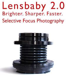
Just a quick note to let you know that if you are a student or educator you can get a much better price on a lens baby. Just go to www.lensbabies.com and order direct from them. We have one on order and cant wait to play.
Friday, April 21, 2006
layer masks
Another blog requested by the paperboy.
Layer masks are a great way to blend images and do local tonal range adjustments.
If you have an image open just drag the background layer down to the create new layer icon in the layers pallete to make a copy of it. Now if you look at the bottom of the layers pallete, the third icon from the left is "create layer mask".
Click this and you will see the mask appear on that layer in the layers pallete.
You now use a paint brush with black ink to hide that layer that the mask is on.
If you make a mistake with the black just paint it back in with white ink. Obviously if the bottom layer is the same as the top this mask will acomplish nothing. Select the bottom layer and do a curve adjustment on it. Now when you paint with black in the mask you will see the underlying layer show through.
Remember that you can use a brush with a low opacity to show through lightly.
You can also apply a gausian blur filter to the mask to blur it.
Layer masks are a great way to blend images and do local tonal range adjustments.
If you have an image open just drag the background layer down to the create new layer icon in the layers pallete to make a copy of it. Now if you look at the bottom of the layers pallete, the third icon from the left is "create layer mask".
Click this and you will see the mask appear on that layer in the layers pallete.
You now use a paint brush with black ink to hide that layer that the mask is on.
If you make a mistake with the black just paint it back in with white ink. Obviously if the bottom layer is the same as the top this mask will acomplish nothing. Select the bottom layer and do a curve adjustment on it. Now when you paint with black in the mask you will see the underlying layer show through.
Remember that you can use a brush with a low opacity to show through lightly.
You can also apply a gausian blur filter to the mask to blur it.
Friday, April 14, 2006
orchard
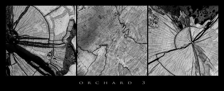
Its funny how you can find a place that just seems to enlighten you.
My son and i walked through the apple orchard today and there was nowhere else i would have rather been. I will be going back often and will have many photos to post.
Thursday, April 13, 2006
old photo site
My buddy the Guru just posted a cool site.
http://westfordcomp.com/updated/found.htm
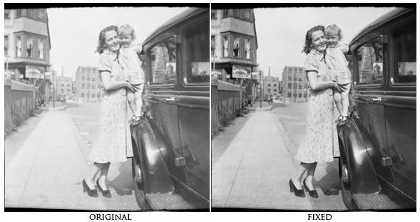
I enjoyed looking at it but at the same time noticed how badly the images were in need of some photoshop work.
I thought that it would be a perfect place for photoshop students to find images to practice on.
I am showing one here I downloaded and worked on for a minute.
I corrected the contrast (via a curve of course), retouched it, used the burn tool set to shadows to darken up the background buildings and sidewalk, and sharpened it using smart sharpen.
Try one, its addicting.
Tuesday, April 11, 2006
feather viewing
Just a quick easy tip tonight.
If you want to apply a feather to a selection to soften the edge you would go to the select menu and down to feather, enter the amount of feather you want and hit ok. The trouble is that you can never tell how much it will feather because it does not give you a preview. If you want a preview just go to quick mask mode (q) after you have set your feather and you will see what affect it will have.
If you want to apply a feather to a selection to soften the edge you would go to the select menu and down to feather, enter the amount of feather you want and hit ok. The trouble is that you can never tell how much it will feather because it does not give you a preview. If you want a preview just go to quick mask mode (q) after you have set your feather and you will see what affect it will have.
Monday, April 03, 2006
autostitch
Some of you who like to stitch photos together using photomerge or the crazy people who do it manually, may be interested in this post. You can download a free stitch program (windows only) at
www.autostitch.net
By default it creates quite a low res file. If you go into edit - options however you can change the size to 100% and jpeg quality to 100. Then all you do is go to open and select the jpeg files you want it to stitch. Hit ok and it does its thing. Very easy and extremely accurate.
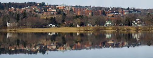
The sample i am posting is made up of 26 images that were shot vertically and handheld. I retouched the sky and water a bit but only for objects that were in the original photos and not for any problems the software had.
www.autostitch.net
By default it creates quite a low res file. If you go into edit - options however you can change the size to 100% and jpeg quality to 100. Then all you do is go to open and select the jpeg files you want it to stitch. Hit ok and it does its thing. Very easy and extremely accurate.
The sample i am posting is made up of 26 images that were shot vertically and handheld. I retouched the sky and water a bit but only for objects that were in the original photos and not for any problems the software had.
Monday, March 27, 2006
white teeth
I do not have much time tonight but still wanted to add a tip.
I had to brighten up some yellow teeth today and thought i would pass the approach along as it was still fresh in my mind.
Select the teeth, i use the lasso tool. Go to image - adjust - hue/saturation.
Here go to the yellow channel and raise the lightness up a bit, also you can lower the saturation a bit. Quite easy.
I had to brighten up some yellow teeth today and thought i would pass the approach along as it was still fresh in my mind.
Select the teeth, i use the lasso tool. Go to image - adjust - hue/saturation.
Here go to the yellow channel and raise the lightness up a bit, also you can lower the saturation a bit. Quite easy.
Saturday, March 25, 2006
image size
My paperboy and good friend dana was looking for some advice yesterday on making a digital file larger in printable size.
I thought i would share some of that advice.
If you want to make your image bigger in height and width:
1) go to image - image size
2) make sure constrain proportions is checked
3) if your files resolution is higher than 200dpi then uncheck the resample image box and change the resolution to 200dpi.
4) hopefully that will get you close to your target size but if not, check the resample image box, set the dropdown menu to bicubic smoother (it should be on bicubic by default), and start scalling upwards in size in 10% increments.
5) after you hit ok to the first 10% adjustment you will have to go back to image - image size and type in the next 10% jump and also set the dropdown menu to bicubic smoother again (you can set a new default by going in to photoshop preferences under the general tab and change it if you like).
If you want to make your image smaller with the image size dialogue box:
1) go to image - image size and check all boxes.
2) set the dropdown menu to bicubic sharper and type in the dimensions that you want.
Personally i just use the crop tool and set the size i want in the options bar when i am shrinking something.
I thought i would share some of that advice.
If you want to make your image bigger in height and width:
1) go to image - image size
2) make sure constrain proportions is checked
3) if your files resolution is higher than 200dpi then uncheck the resample image box and change the resolution to 200dpi.
4) hopefully that will get you close to your target size but if not, check the resample image box, set the dropdown menu to bicubic smoother (it should be on bicubic by default), and start scalling upwards in size in 10% increments.
5) after you hit ok to the first 10% adjustment you will have to go back to image - image size and type in the next 10% jump and also set the dropdown menu to bicubic smoother again (you can set a new default by going in to photoshop preferences under the general tab and change it if you like).
If you want to make your image smaller with the image size dialogue box:
1) go to image - image size and check all boxes.
2) set the dropdown menu to bicubic sharper and type in the dimensions that you want.
Personally i just use the crop tool and set the size i want in the options bar when i am shrinking something.
Monday, March 20, 2006
podcasts
I talked to my students today about our relationship soon coming to an end. I did not see any tears in the crowd and one girl didn't even know i was in the room let alone speaking (you know who you are).
My point in all this is that they will have to start finding resources for advancing their photoshop knowledge on their own. As photographers, photoshop will be an invaluable tool. They don't believe me yet but they will before long.
One resource i have used myself lately is podcasts. You can download itunes from
www.apple.com
and then go to the podcast link on the left hand side. Then click on the words "podcast directory" at the bottom of the page. Scroll down a bit until you see the search space and type in these names to start you off:
- russell brown
- photoshop tv
- photoshop tips
In the photoshop tips you are looking for matt kwoskowski killer tips.
I subscribed to them all (free of course) and just double click the subjects you want to watch and click on the little video window at the bottom left of the itunes screen and it will become bigger.
Watch and learn.
My point in all this is that they will have to start finding resources for advancing their photoshop knowledge on their own. As photographers, photoshop will be an invaluable tool. They don't believe me yet but they will before long.
One resource i have used myself lately is podcasts. You can download itunes from
www.apple.com
and then go to the podcast link on the left hand side. Then click on the words "podcast directory" at the bottom of the page. Scroll down a bit until you see the search space and type in these names to start you off:
- russell brown
- photoshop tv
- photoshop tips
In the photoshop tips you are looking for matt kwoskowski killer tips.
I subscribed to them all (free of course) and just double click the subjects you want to watch and click on the little video window at the bottom left of the itunes screen and it will become bigger.
Watch and learn.
Subscribe to:
Posts (Atom)